
World Table Tennis
Project: Federation Rebrand
This case study shows my repsonse to a pitch request to rebrand the table tennis federation ITTF. All creative shown here was developed myself under the supervision of the Creative Director.
The brief required a new federation identity which was modern and dynamic - and most importantly for them made a clear visual connection to the sport itself.
The pitch was unfortunately unsuccessful but was a great project to be involved in and I was proud of the final results.
Disciplines
Concepting
Branding
Illustration
Design
Year
2019
Agency
Works
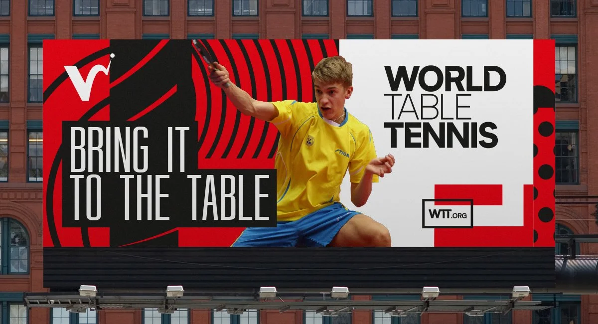
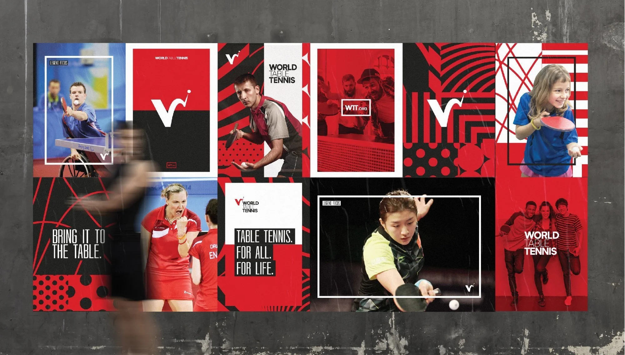
BRING IT TO THE TABLE
This became our new proposition for the identity, it spoke of confidence and dynamism as well as having a direct link to the sport itself.

Table tennis is the only sport where the ball is allowed to touch the surface twice. This unique aspect was inspiration for the federation mark, using the flight of the ball to depict an abstract ‘W’ using colours synonomous with the sport itself.
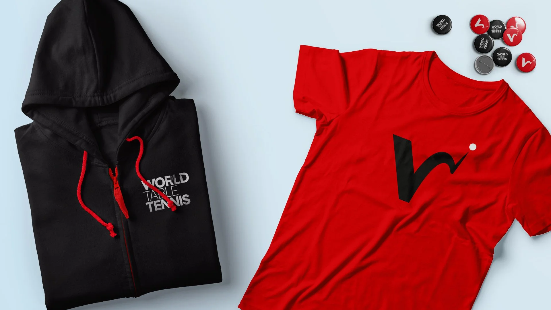
The secondary branding system was developed using movements of the ball during the game. This gave us a suite of patterns and markings which were flexible and unique.


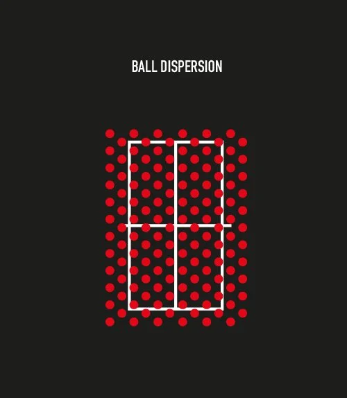

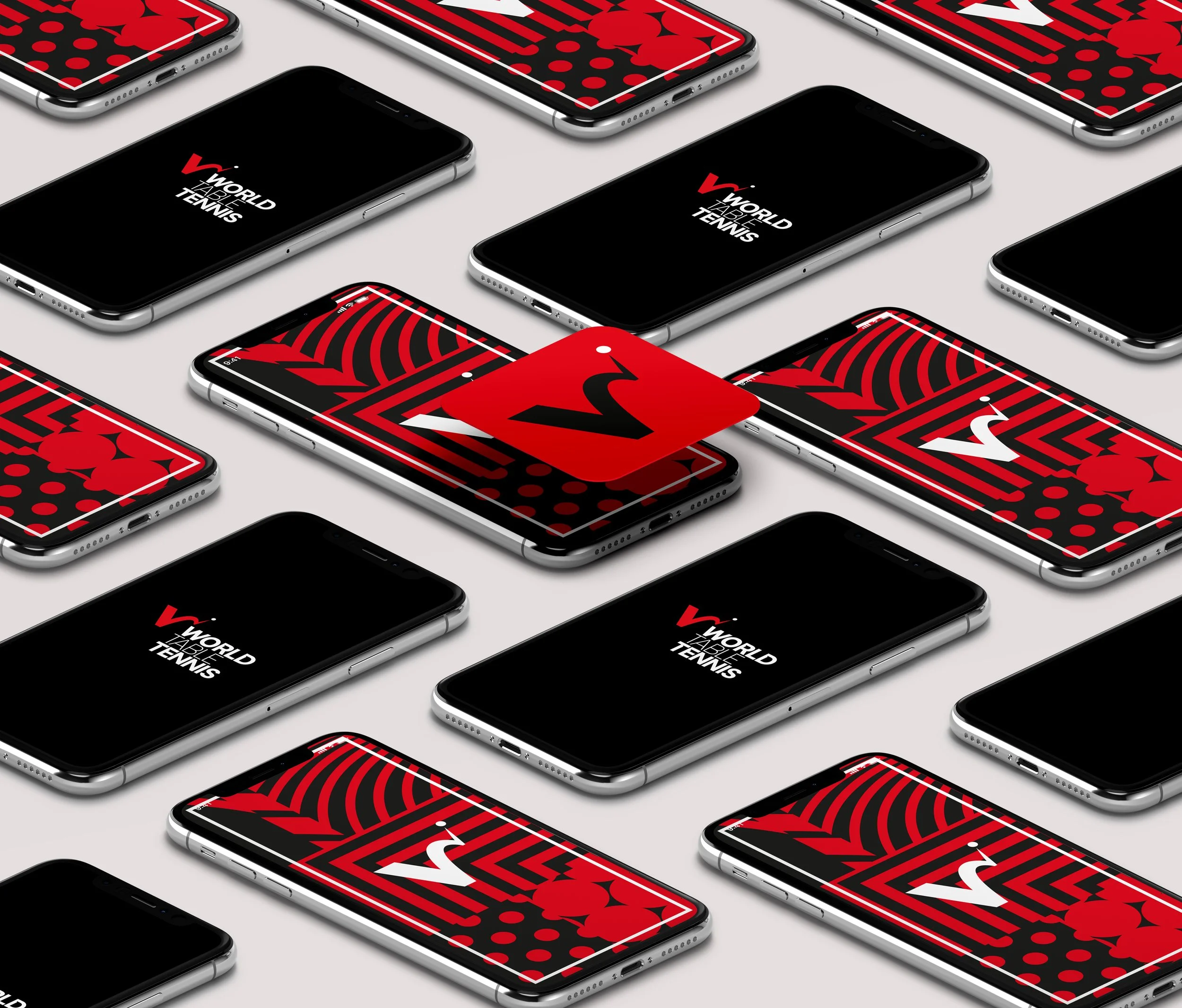

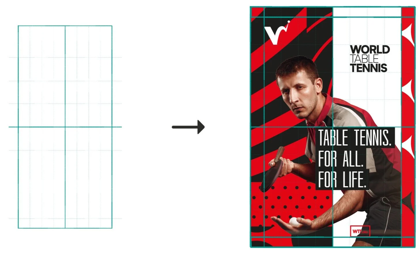
The Table itself is used as a foundation for the grid around which the identity is structured.
This could be proportionally stretched vertically or horizontally to provide the required format
Teaser Animation
We created a short teaser animation to give a flavour of the new proposed brand to show how some of the elements could be brought to life.
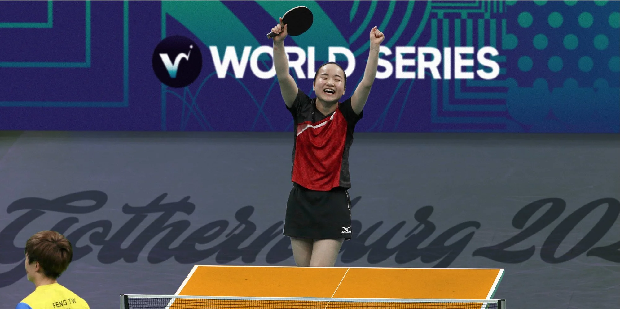
Part of the brief also required consideration for how the identity could flex for tournament events.
This could be acheived by the introduction of additional tyepfaces for location specific wordmarks and the injection of colours and local patterns to compliment the core brand.