
ASCO
Project: Rebrand
What sets ASCO apart from their logistics competitors is the ability to deliver when others cannot. Whatever the environment you can rely on ASCO to develop an appropriate plan to deliver, consistant perfection. Sometimes it might require creativity in developing new processes. Experience and analysis come together to create a service unlike any other company working in the logistics sector.
Disciplines
Concepting
Branding
Year
2025
Agency
Propaganda
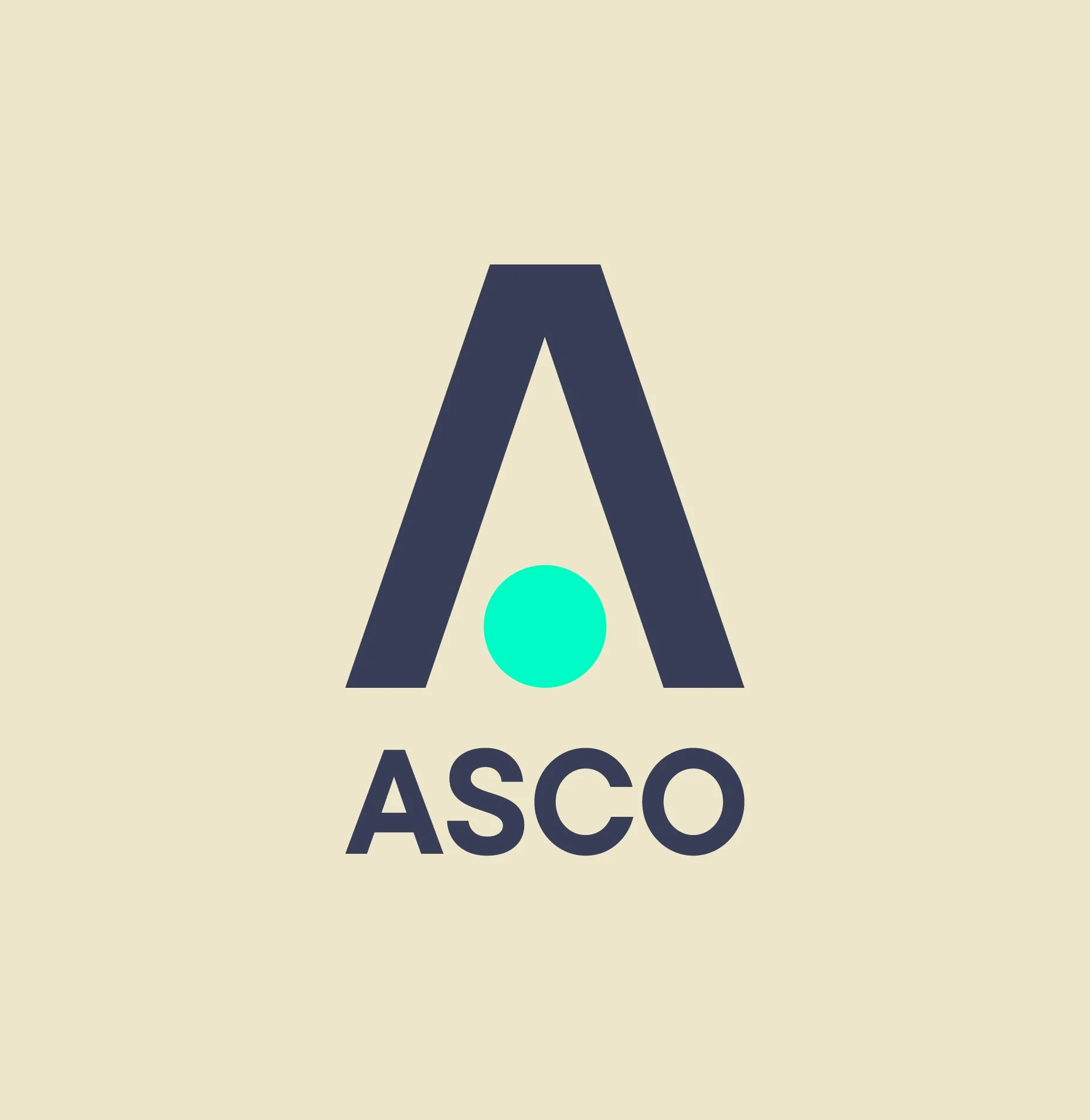
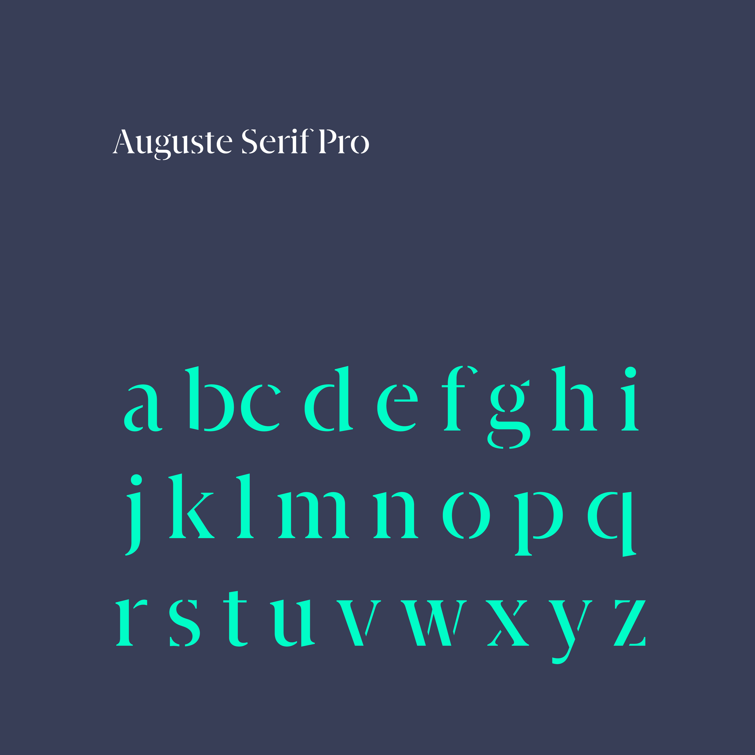
Brand mark
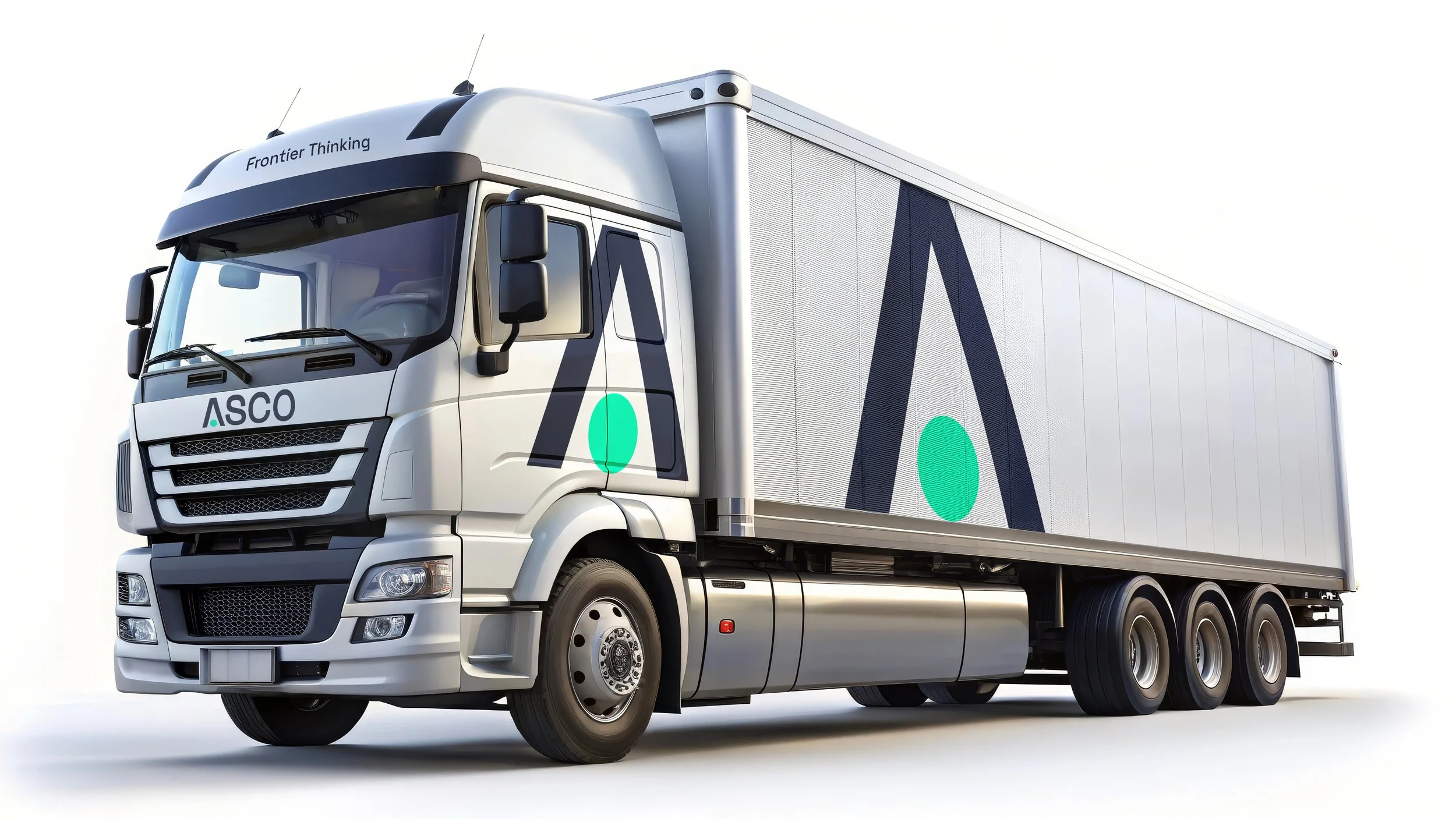
Precision in delivery is essential to the processes ASCO conducts on terrains which can be testing. The brand icon reflects this with a bold mark which is suitable for both contemporary digital application and rugged offshore workwear.
Frontier Thinking
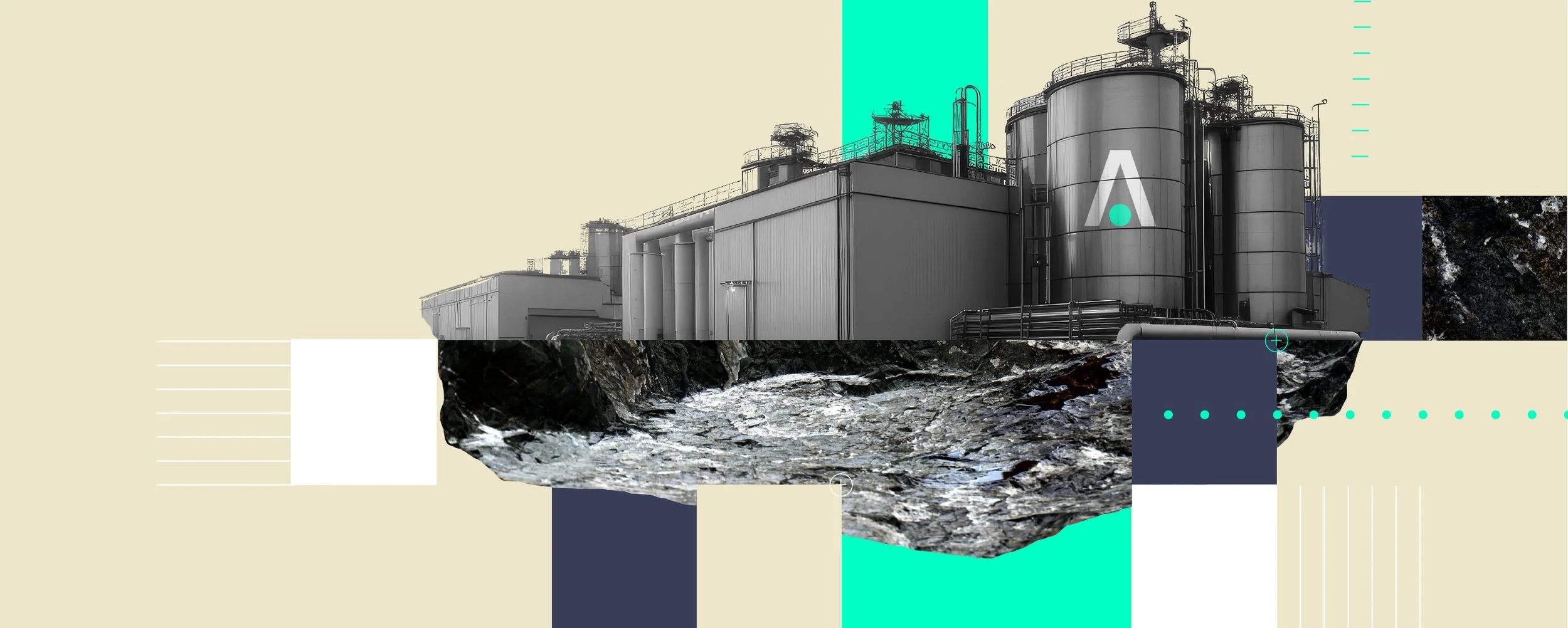
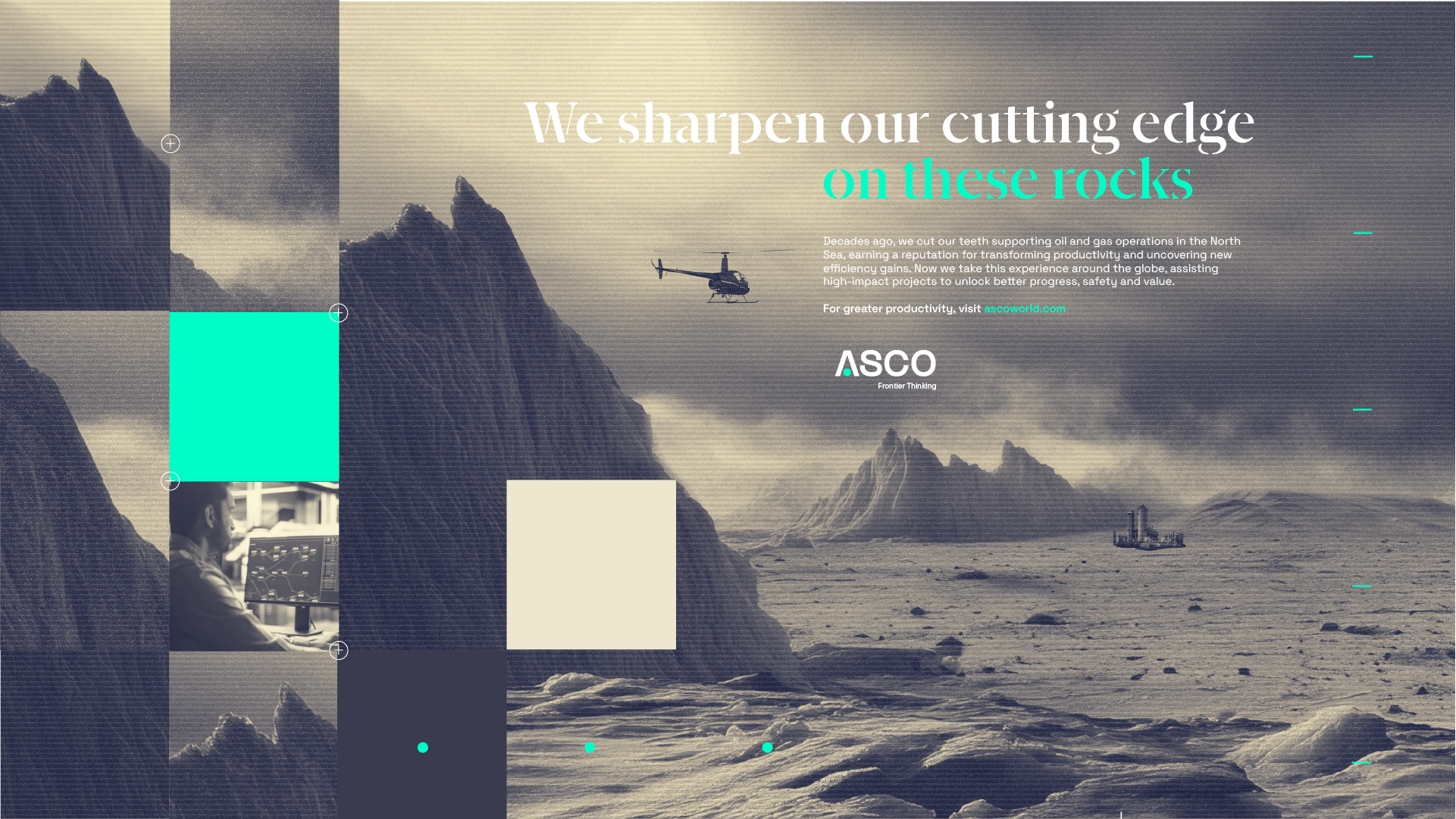
Many of the challenges that ASCO encounter are related to the natural environment so the brand has used a muted natural palette with bright contemporary accents.

The rebrand repositions ASCO apart from its competitors with a dynamic and flexible design system which reflects the state of permanent analysis and creativity which is required to provide solutions which have previously not been developed.
Key visuals
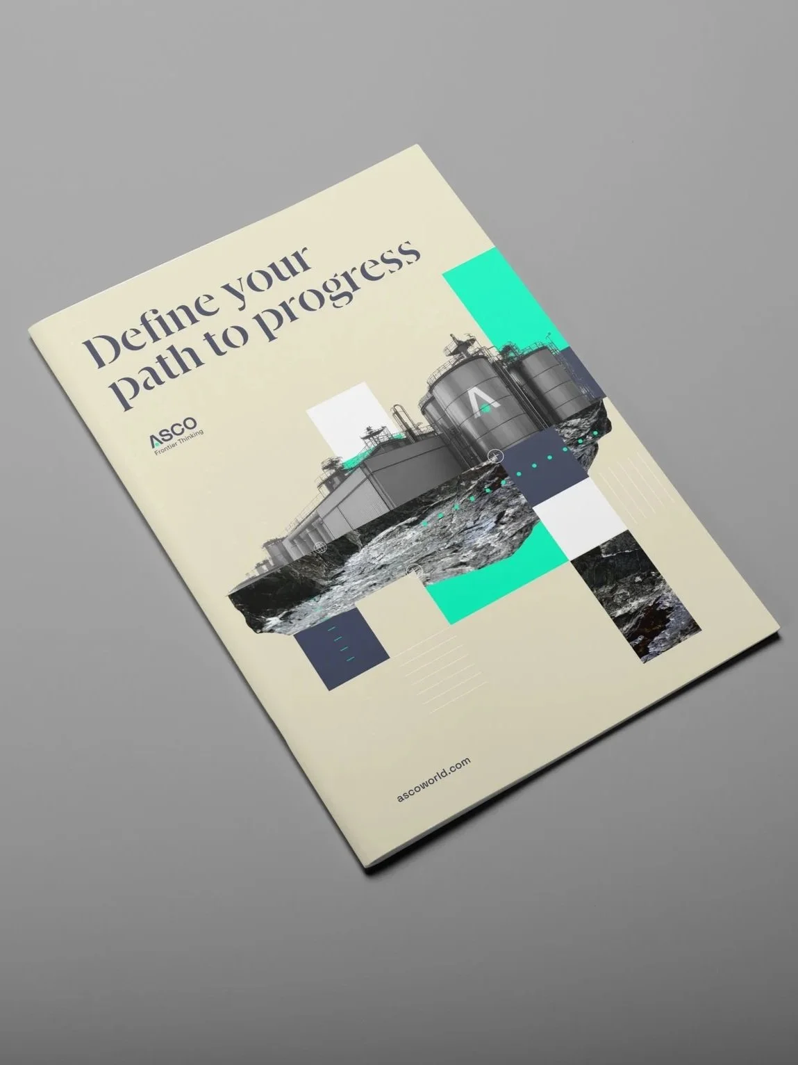
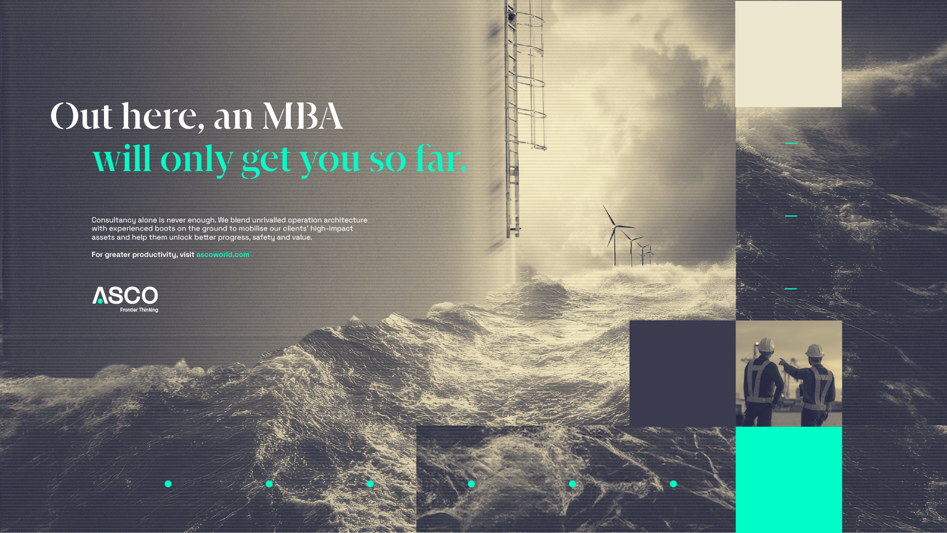
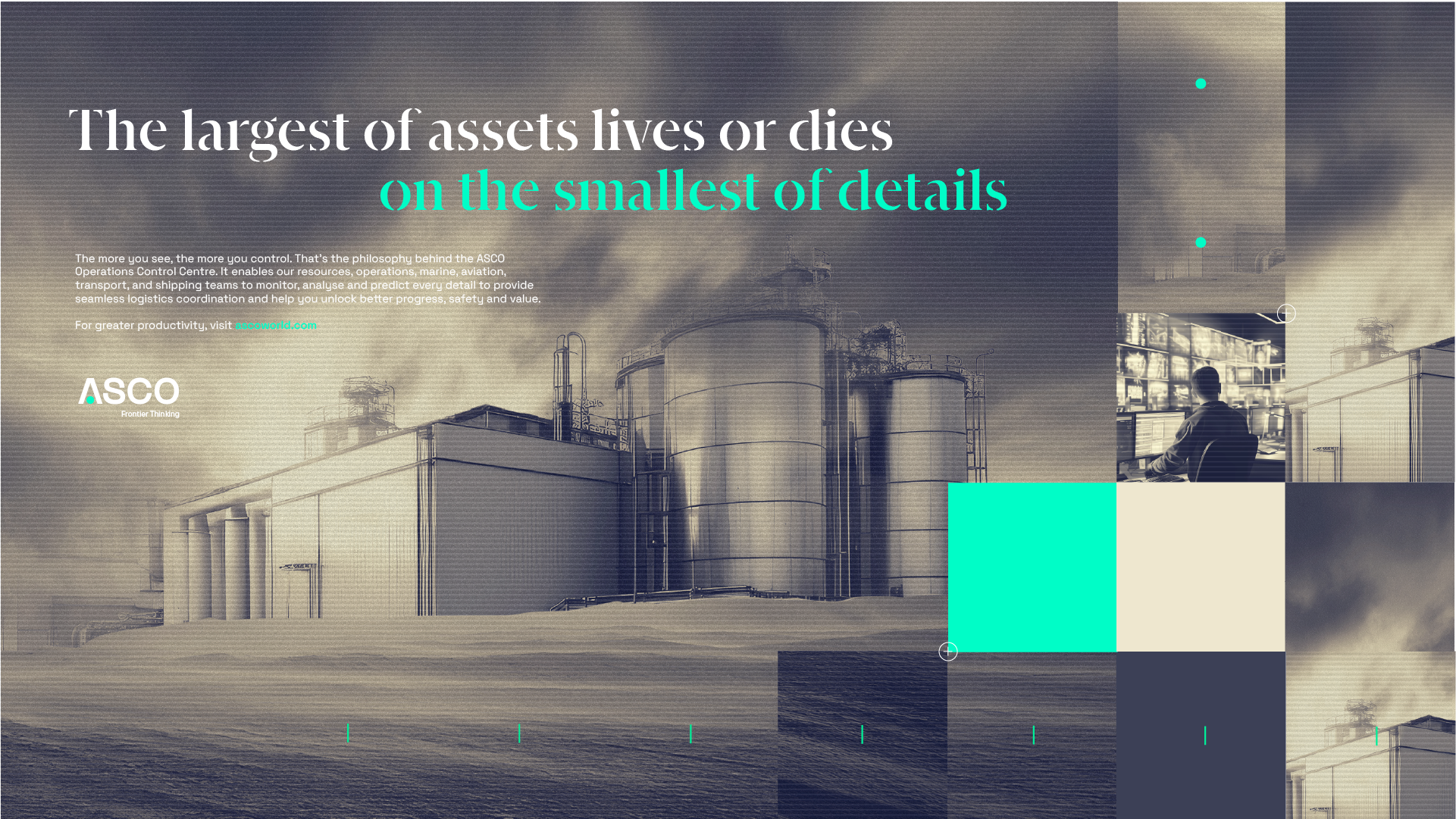
A set of key visuals were developed to communicate the new ASCO proposition to new and existing customers.
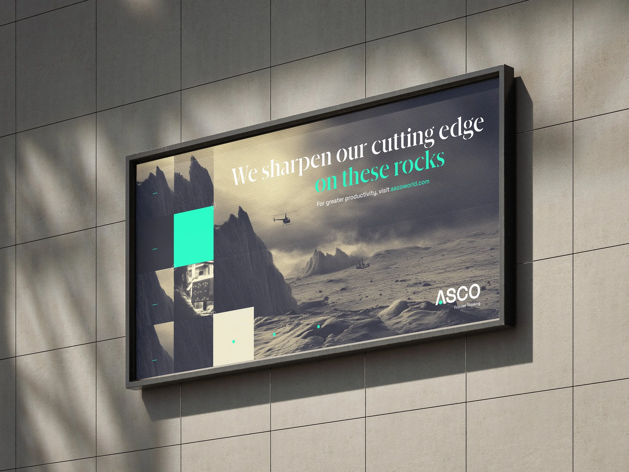
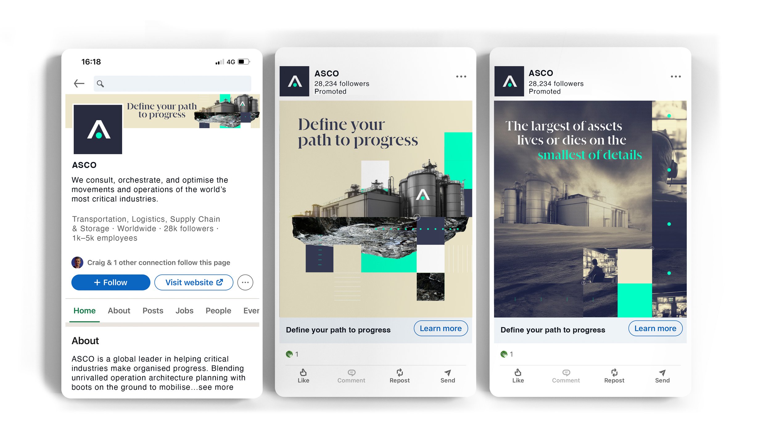
Rollout
Example applications of the ASCO brand.
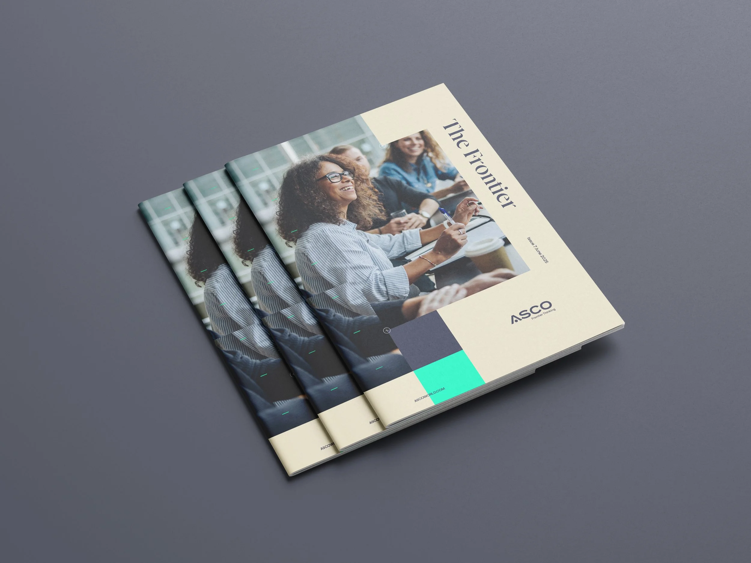
Internal
Literature
An internal document is proposed to communicate between the various parts of the ASCO hierachy. A flexible design template is shown below to help delive this.
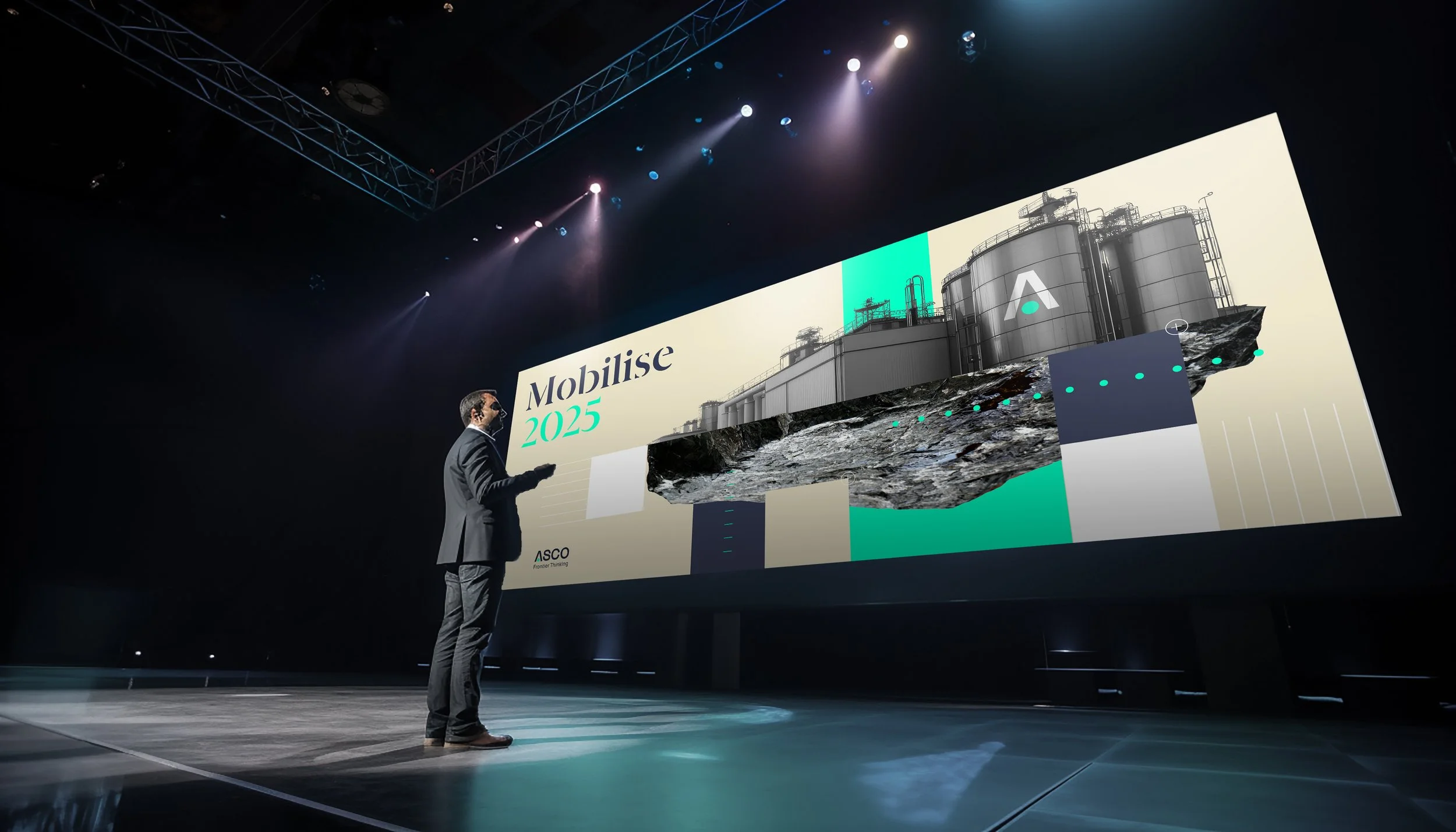
Utilising the brand for trade events will be an important part of growing the ASCO brand.
Making the brand appropriate for workwear across lots of various deliverables is essential for when working in challenging environments.