EPCR
Project: Event identity & campaign
This project was split into 2 parts. An event brand which could be used to dress stadiums for the event itself but initially an advertising campaign to generate ticket sales and announce the location of the events
Disciplines
Concepting
Copy Writing
Design
Art Direction
Year
2017
Agency
Works
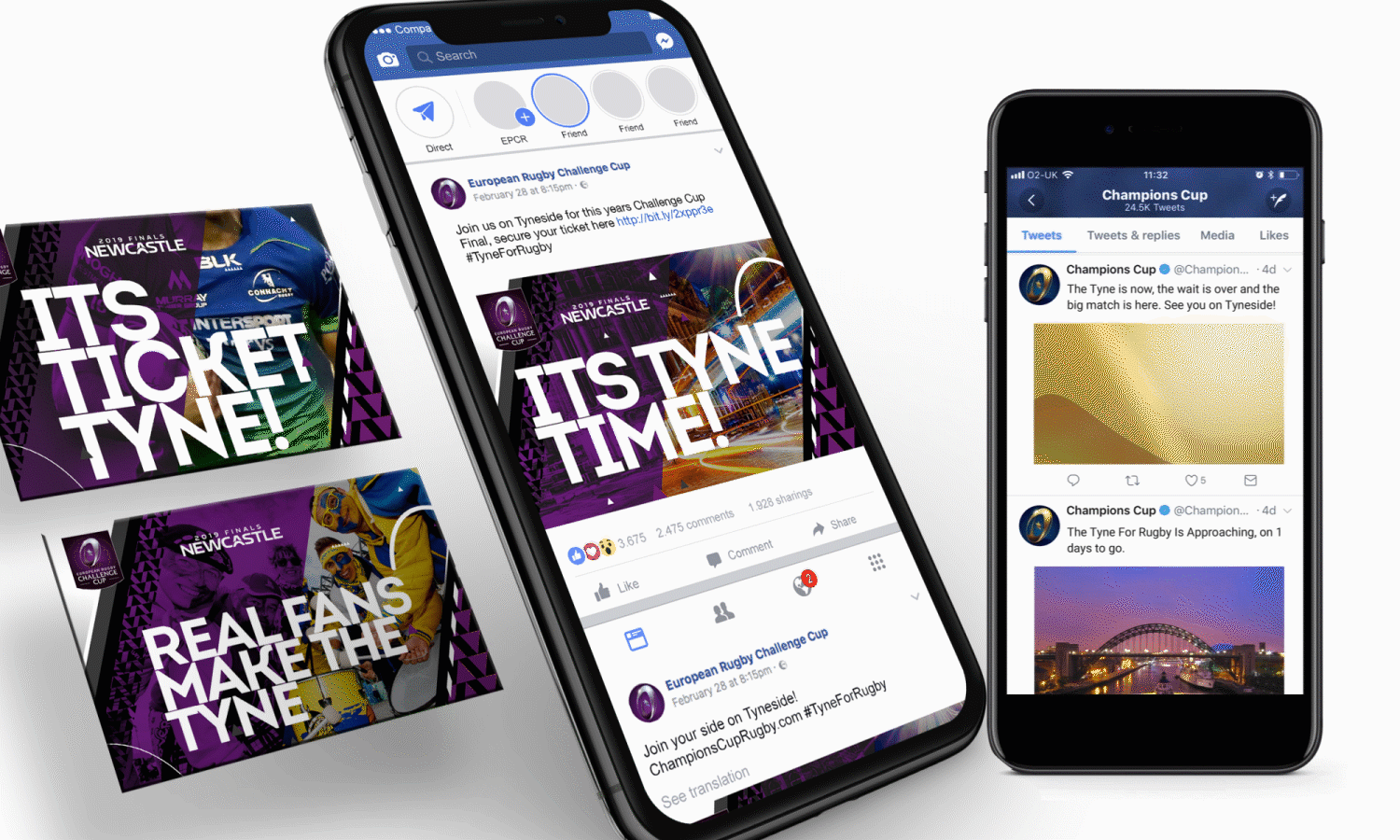
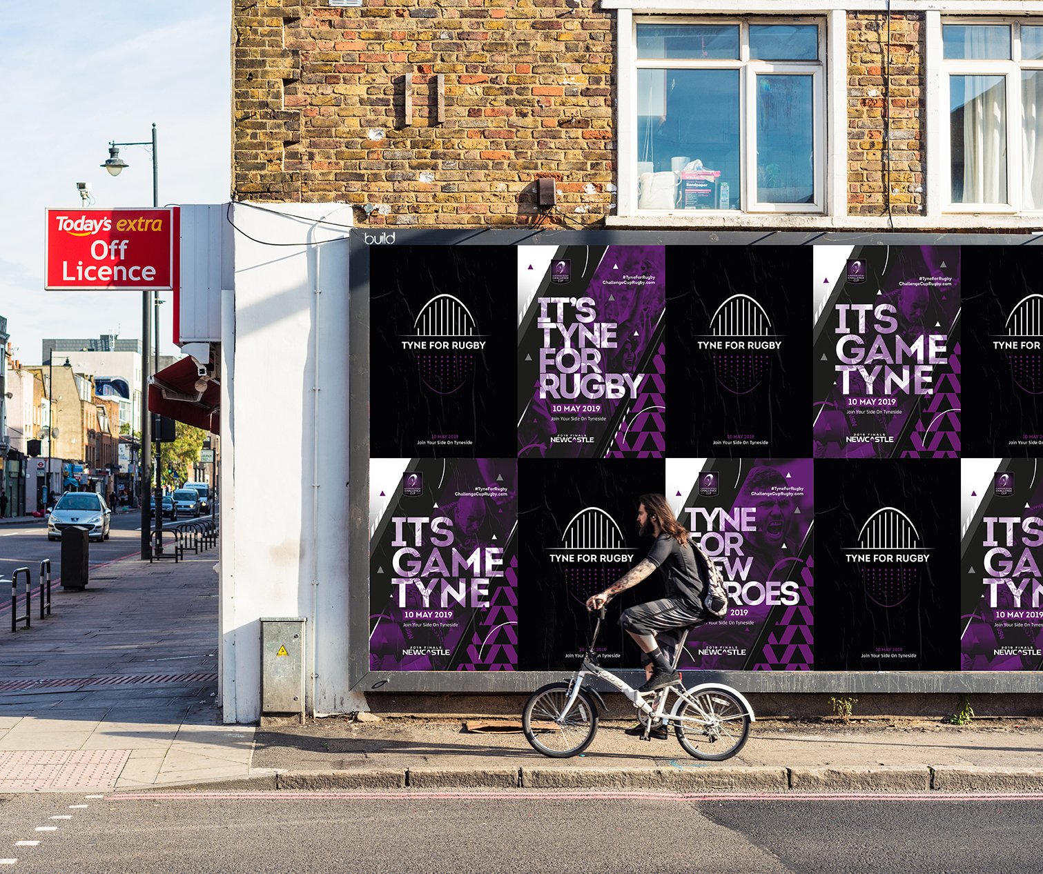
Tyne for rugby
The campaign messaging centred around a play on words, using the word Tyne instead of time to deliver various messages. This focus on time gives the camapgin a sense of urgency and direction to purchase tickets. Examples of how this could flex are shown through this case study.
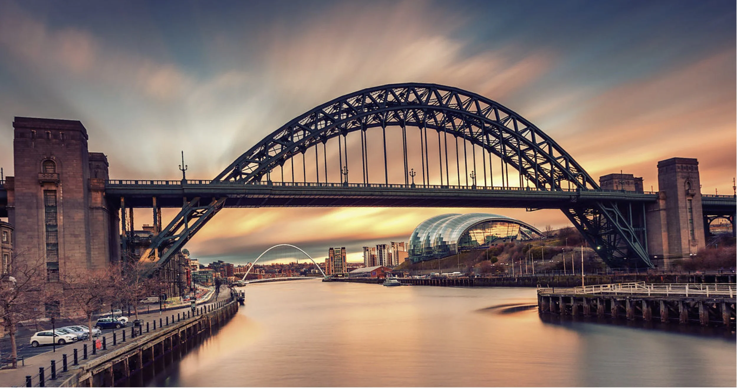
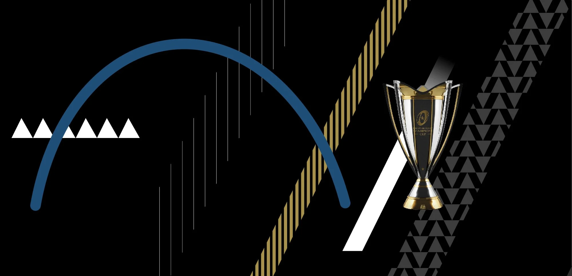
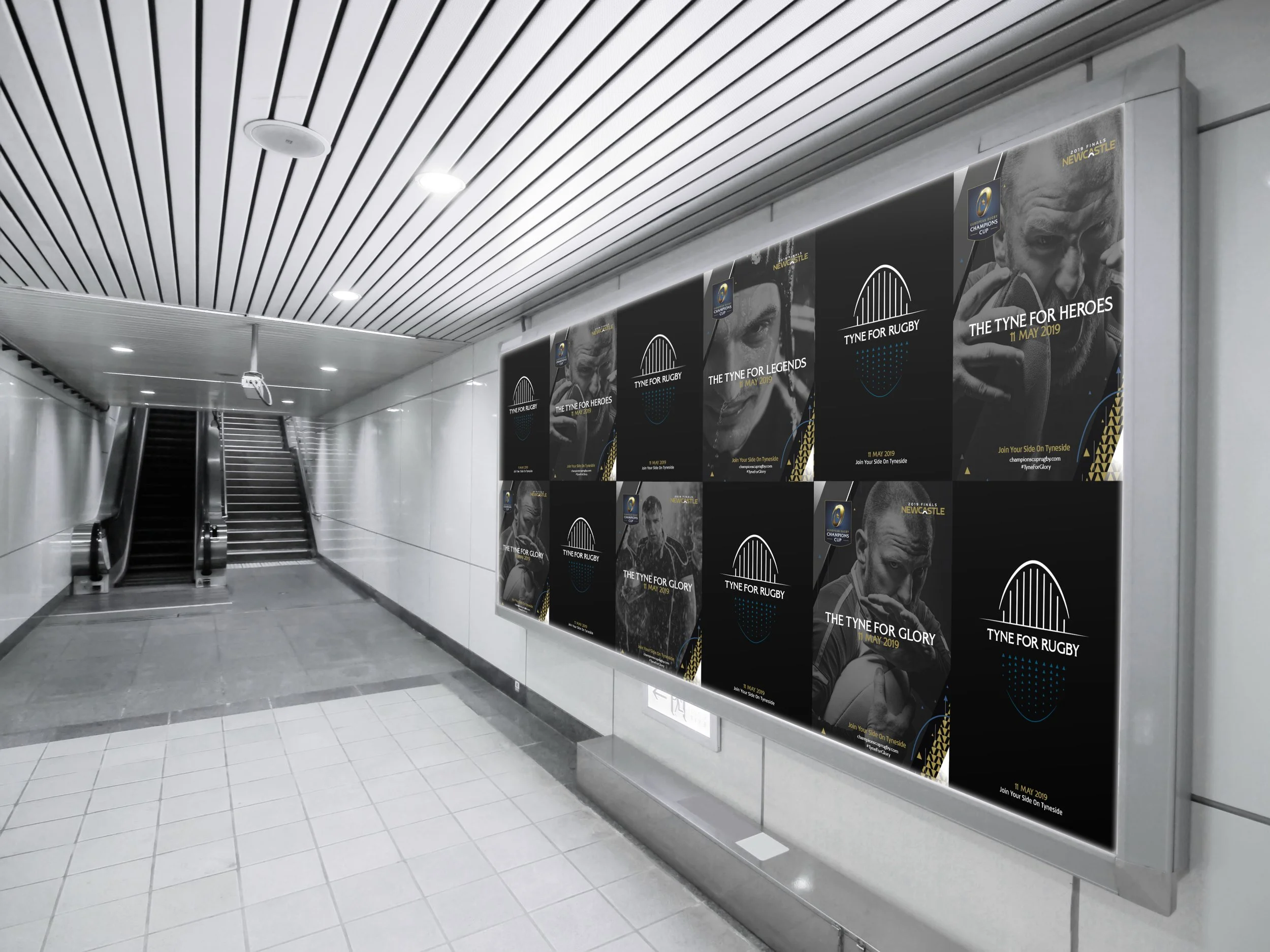
Shapes and markings from the iconic Tyne Bridge are deconstructed to create a pallete of graphics to form part of the campaign identity.
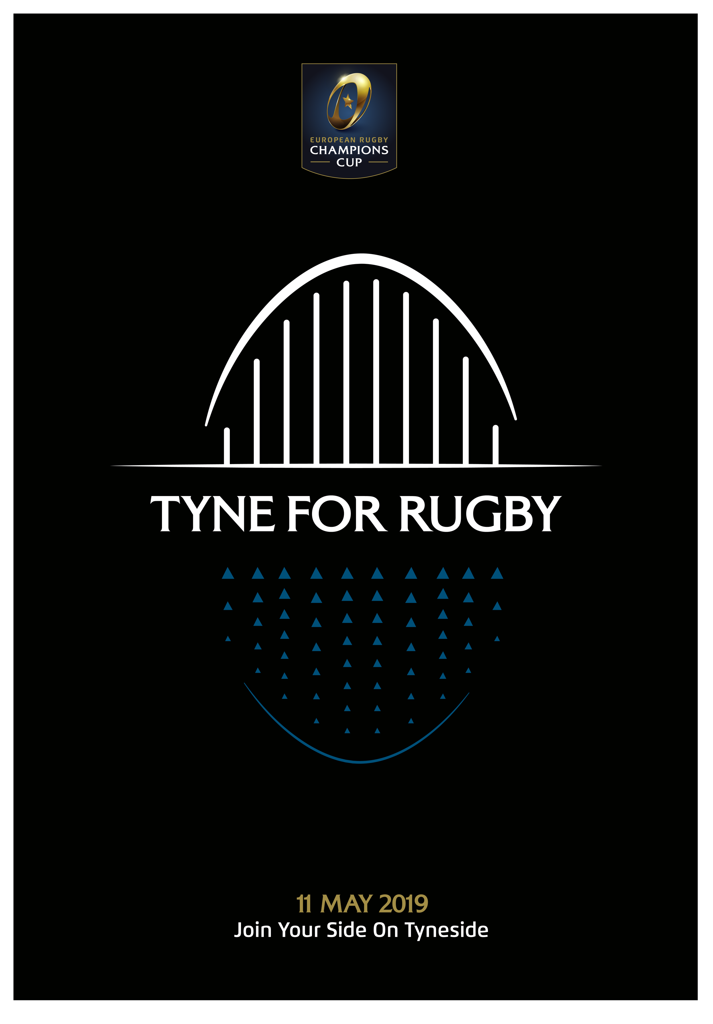
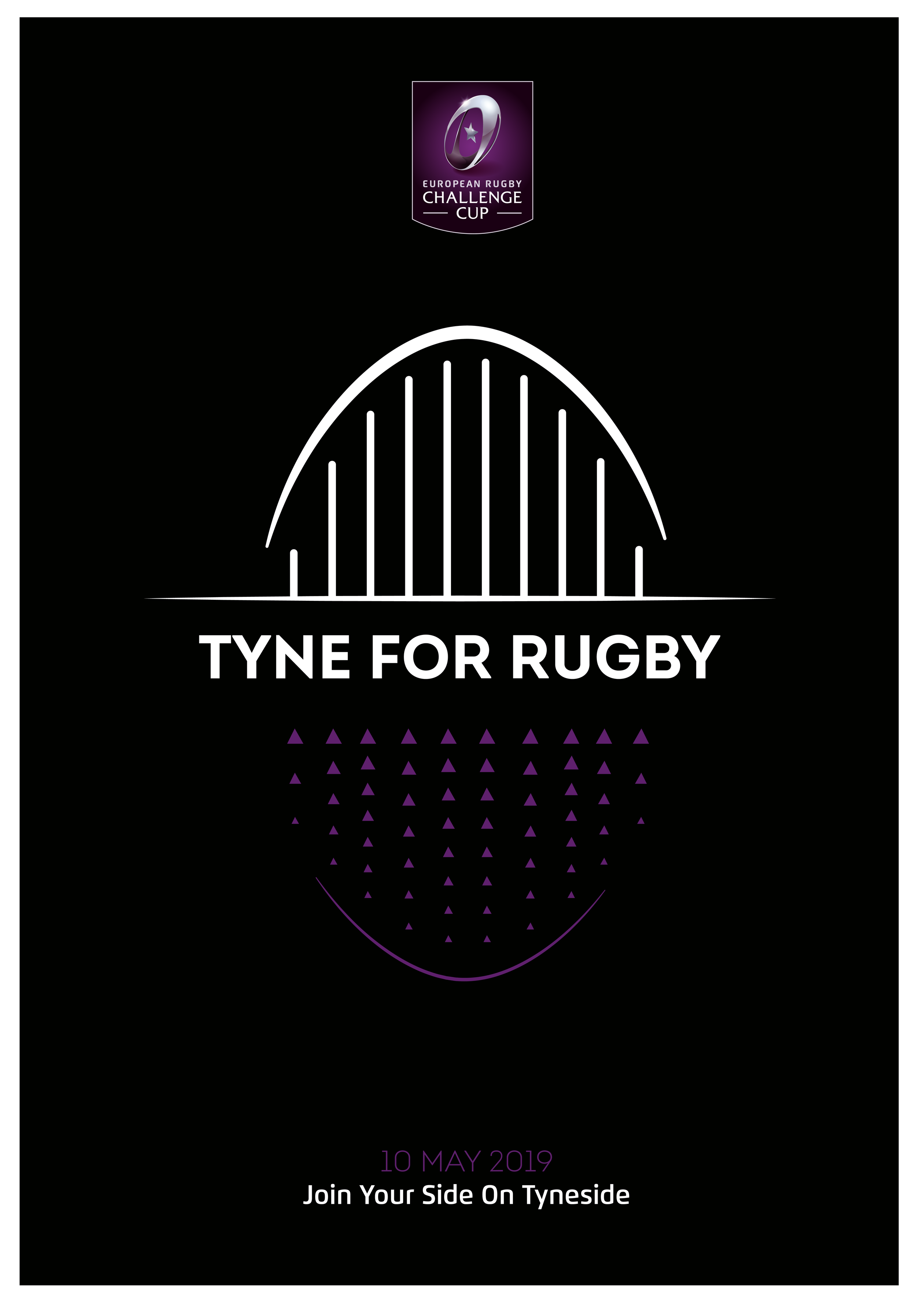
Initially 2 graphics were proposed to tease the introduction of the event refresh, these were comprised of the shapes taken from the Tyne bridge and made to create an abstract rugby ball.
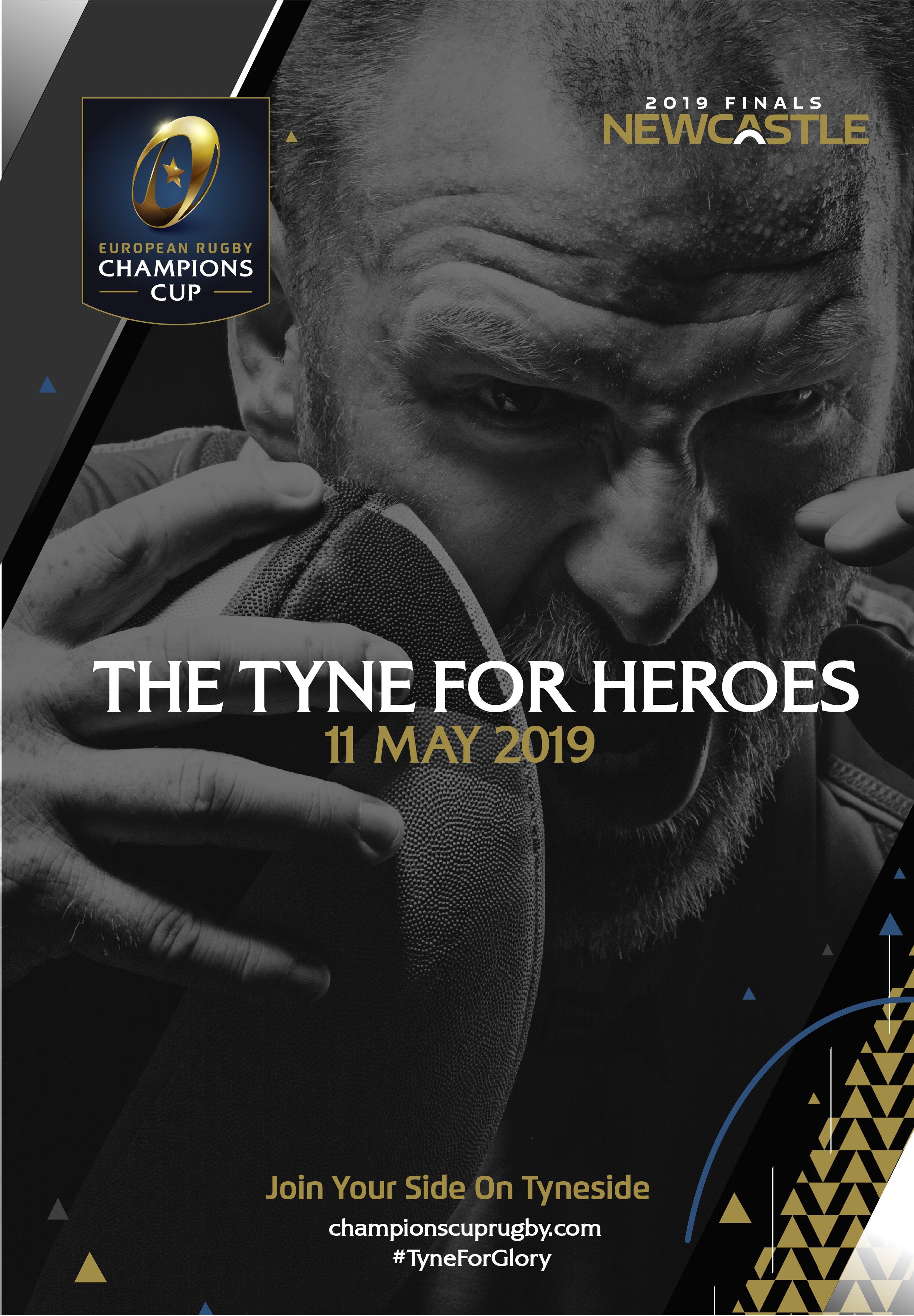
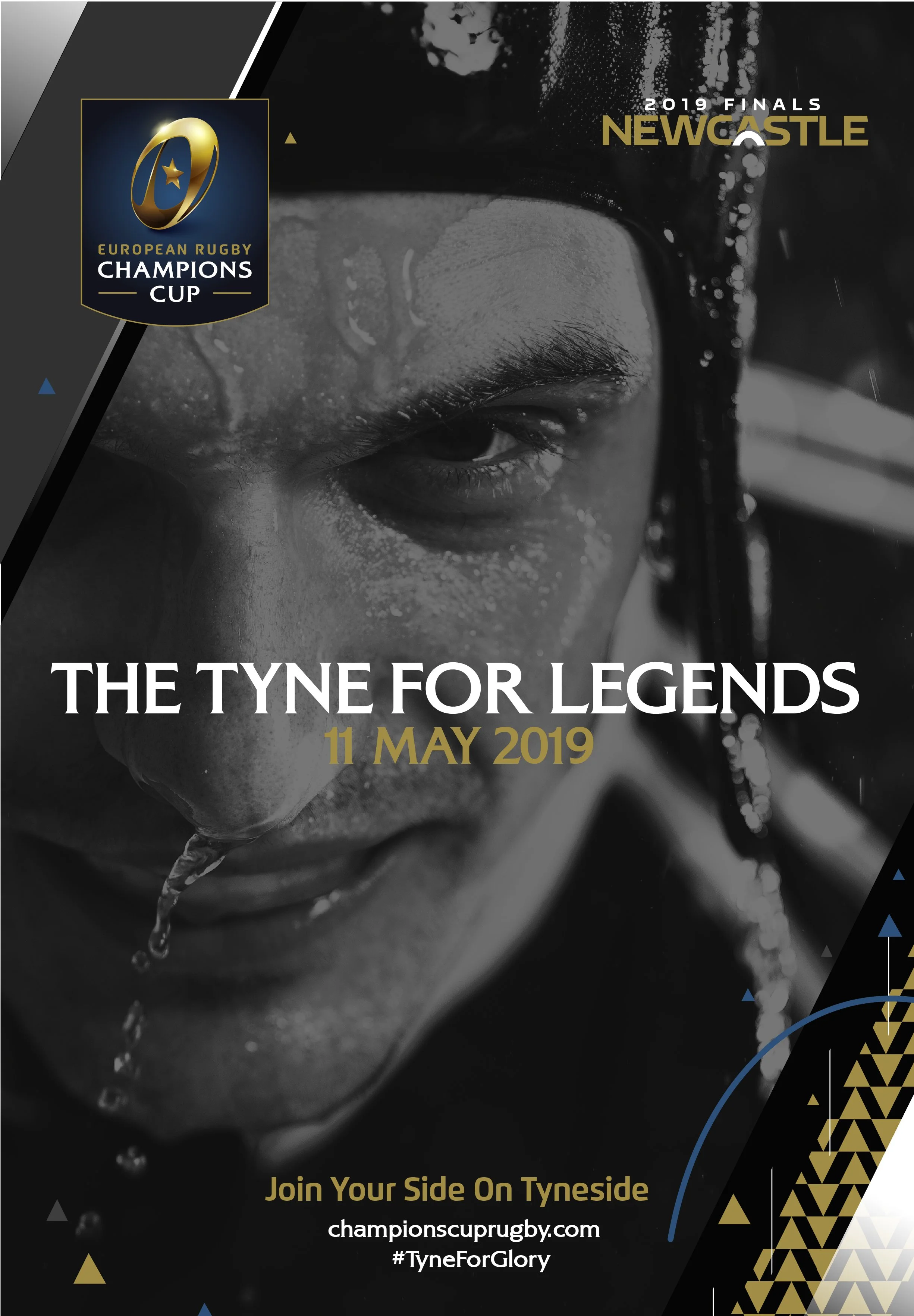
The Champions Cup identity is the premium event in the calendar. To articulate this visually we focus on the players, they are the best of the best and represent technical excellence. We proposed to show them using iconic black and white photography with close up details to communicate a sense of drama and immersion in the event.
Bringing it all together
Example animation for the pitch
We proposed to position the The Challenge Cup slightly differently, where as the Champions Cup is the premium event and all about the best players on the planet we proposed focussing on the fans and for the Challenge Cup to be a celebratory party atmosphere.