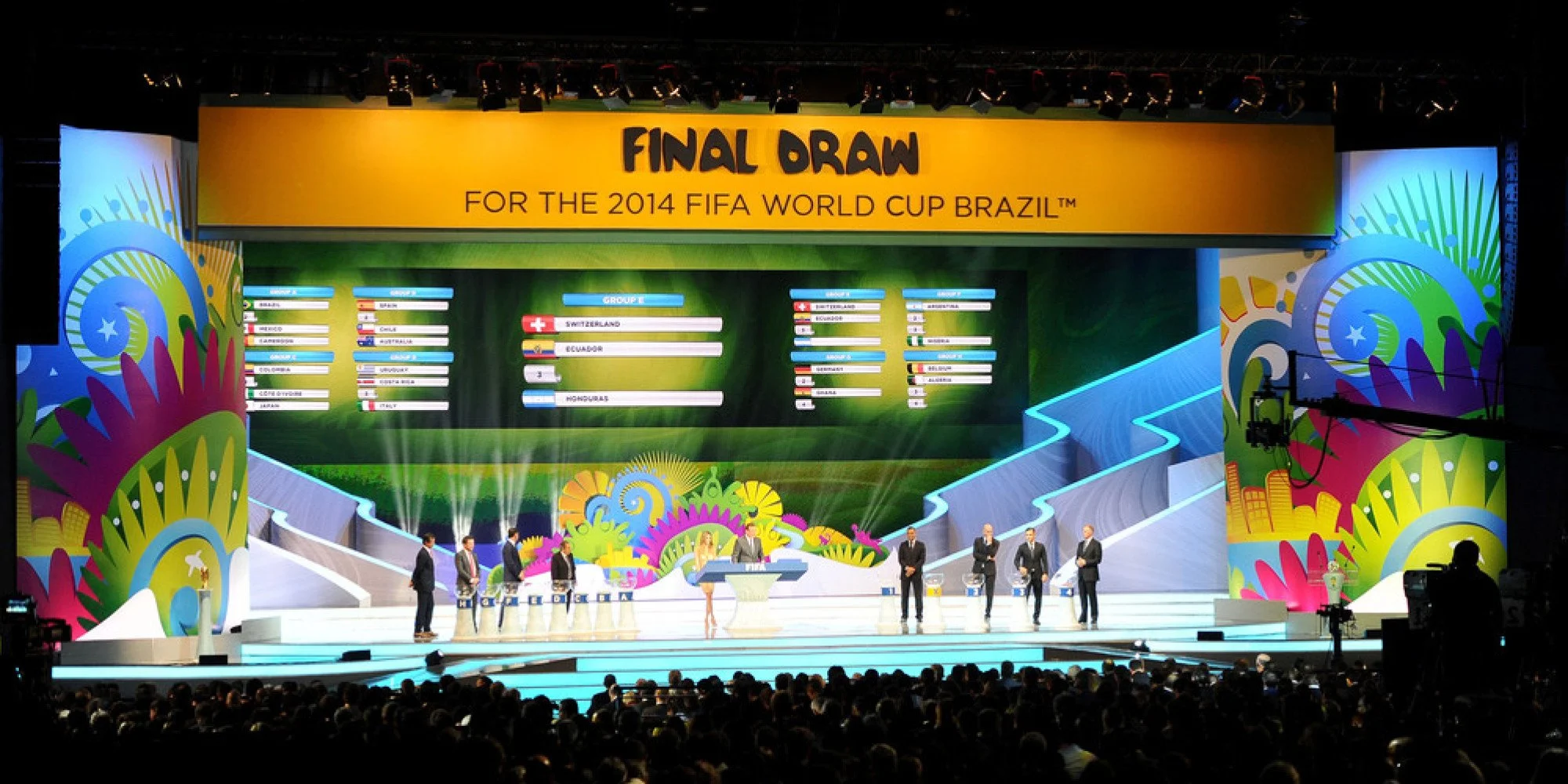
FIFA World Cup Brazil 2014
Project: Event identity
I was the creative lead throughout this project, working alongside the creative director. When required I would work with other designers and artworkers both internally and with FIFA’s internal design team.
I concepted and visualised the initial pitch creative and then developed and artworked the winning visuals.
Disciplines
Concepting
Illustration
Design
Artworking
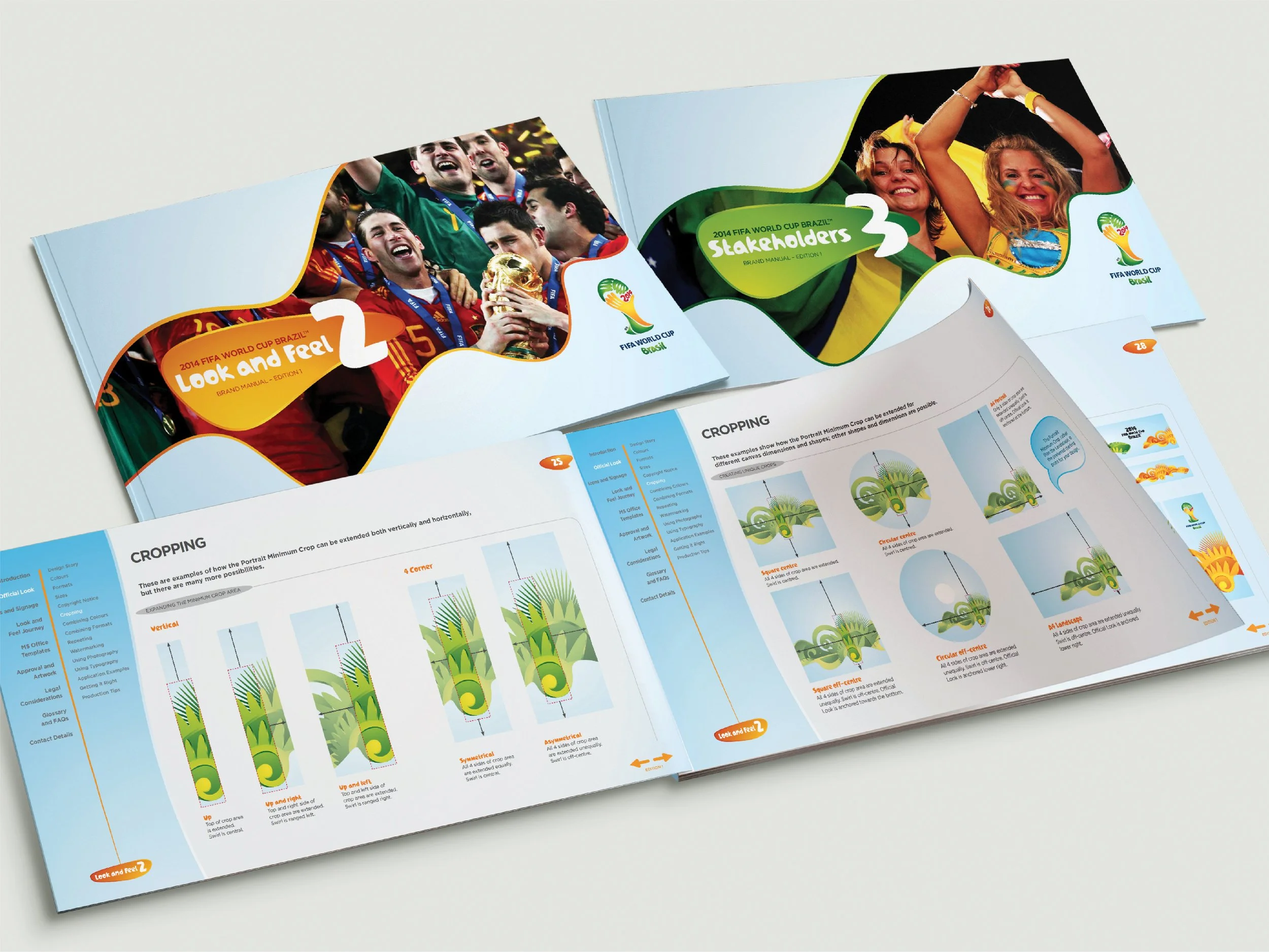
Guidelines
Licensing
Font design
Client handling
Year
2010 - 2014
Agency
Works
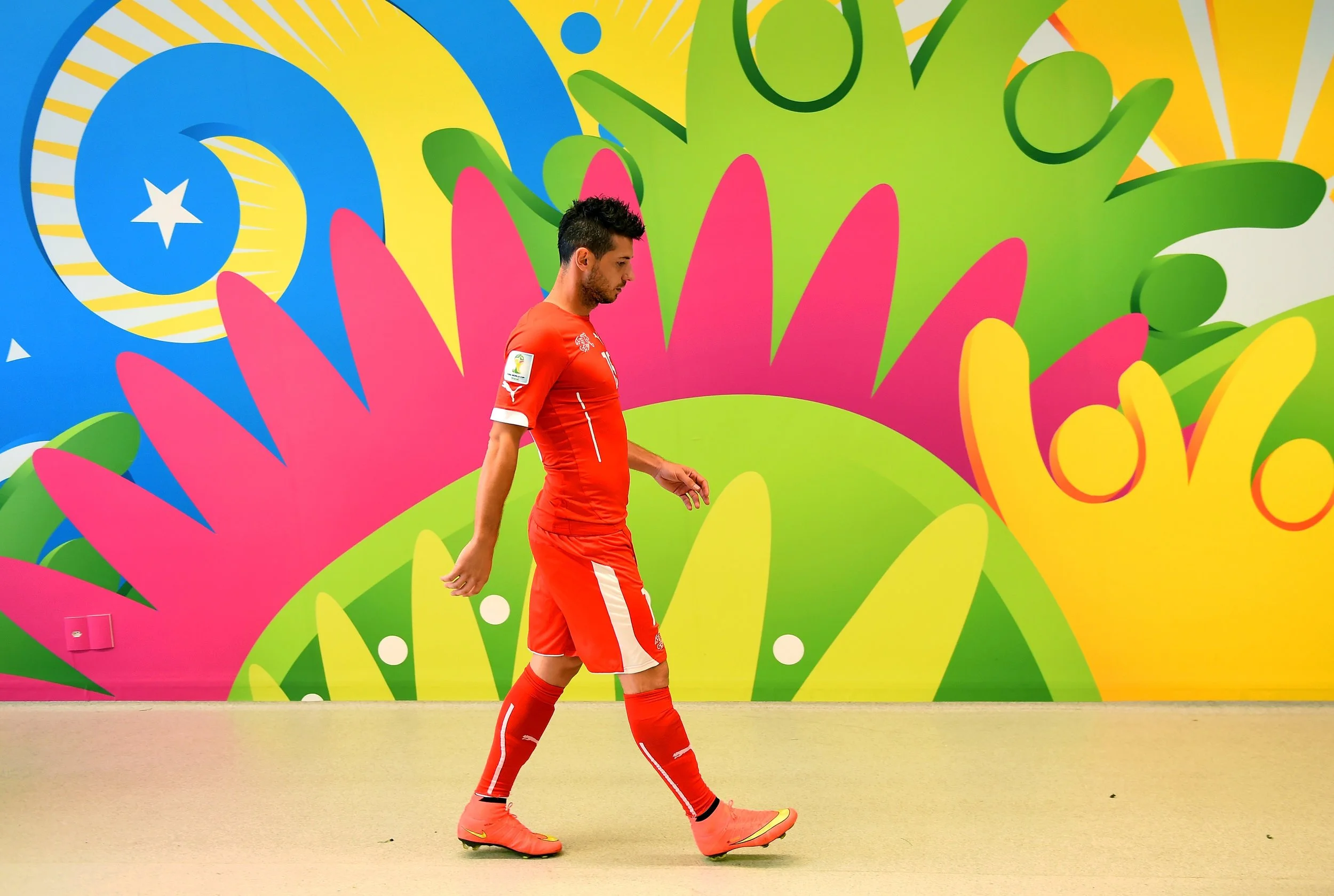
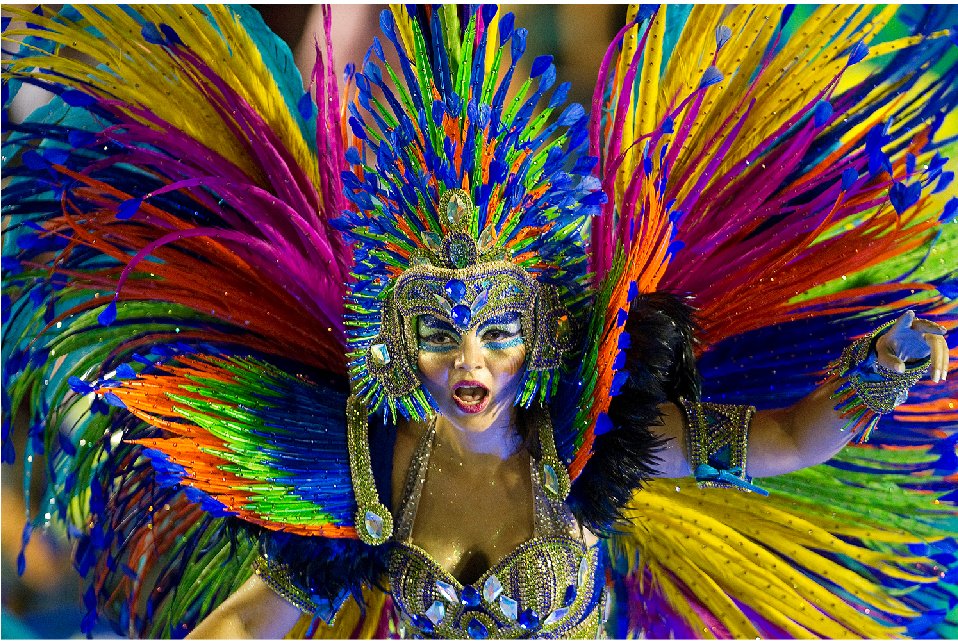
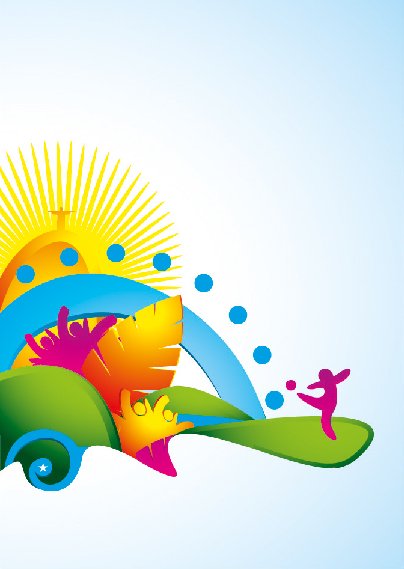
The initial brief began with a pre-existing emblem, developed by a local Brazilian agency, our challenge was to develop an event look and feel which would compliment the logo and feel like an extension of its values.
The Problem?
How do we capture the essence of Brazil and relate it to the emblem?
The Answer?
Style of Icon + Brazilian Icons = Identity
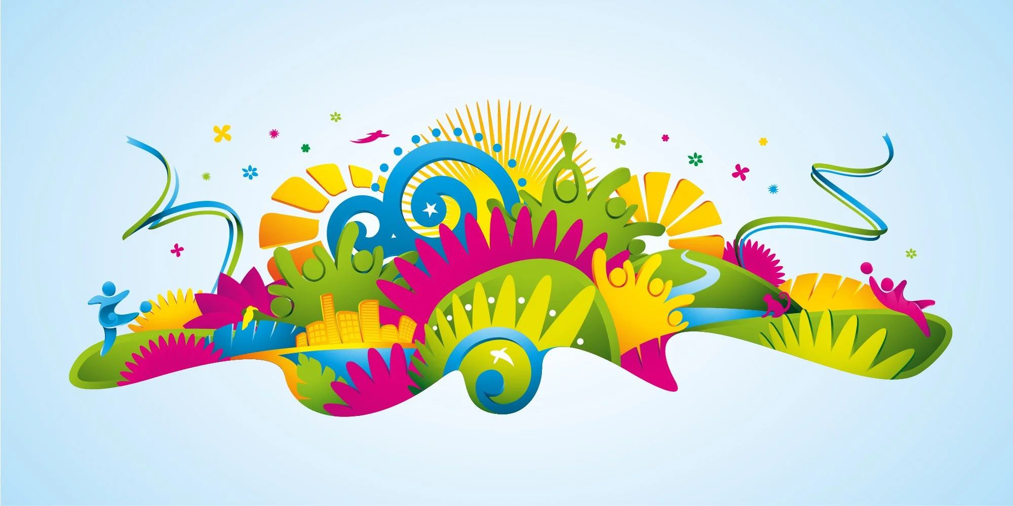
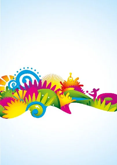
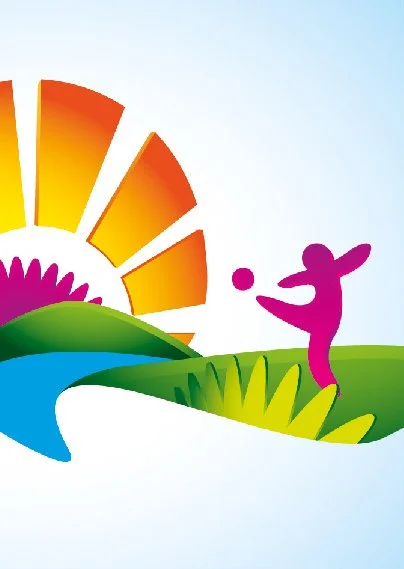
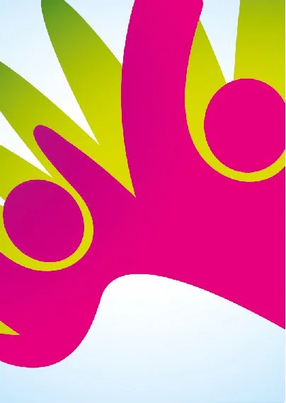
The original intention with the identity was to take the style of the Official Look and deconstruct it to give us a set of flexible assets which could be used in various ways. The client however decided on a more rigid approach.
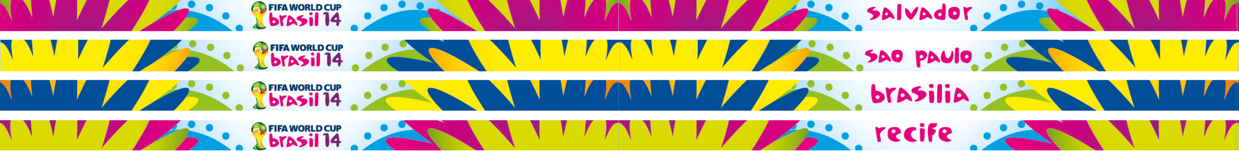
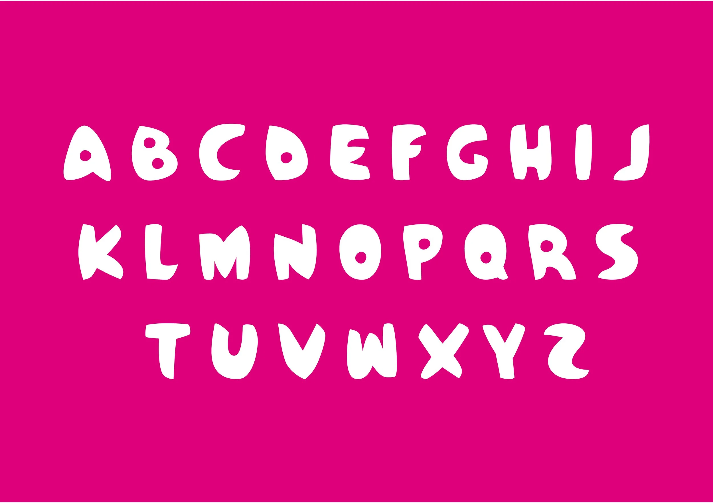
A full bespoke typeface was developed for the event, we called it Pagode, a Brazilian word meaning celebrations involving music dancing and food.
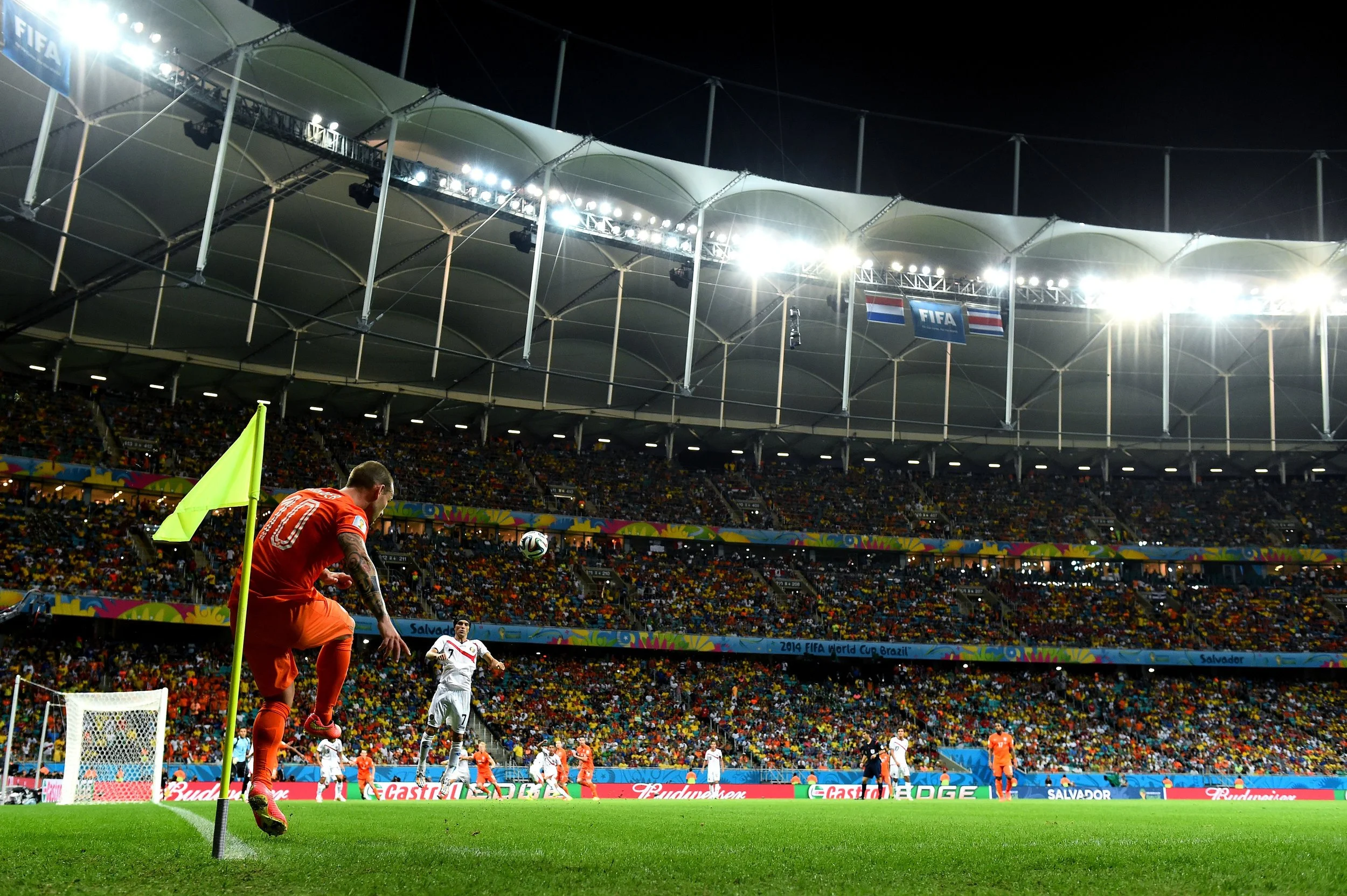
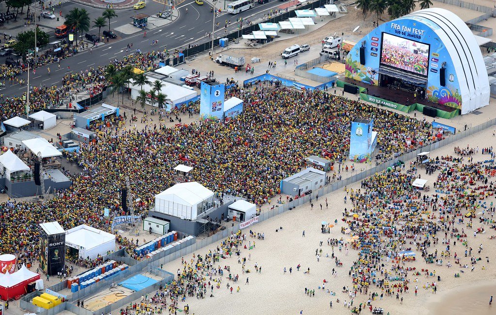
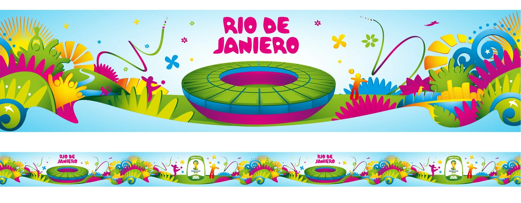
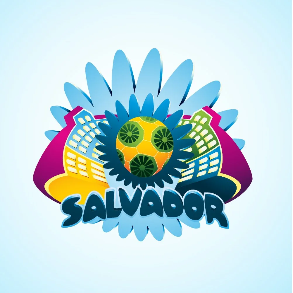
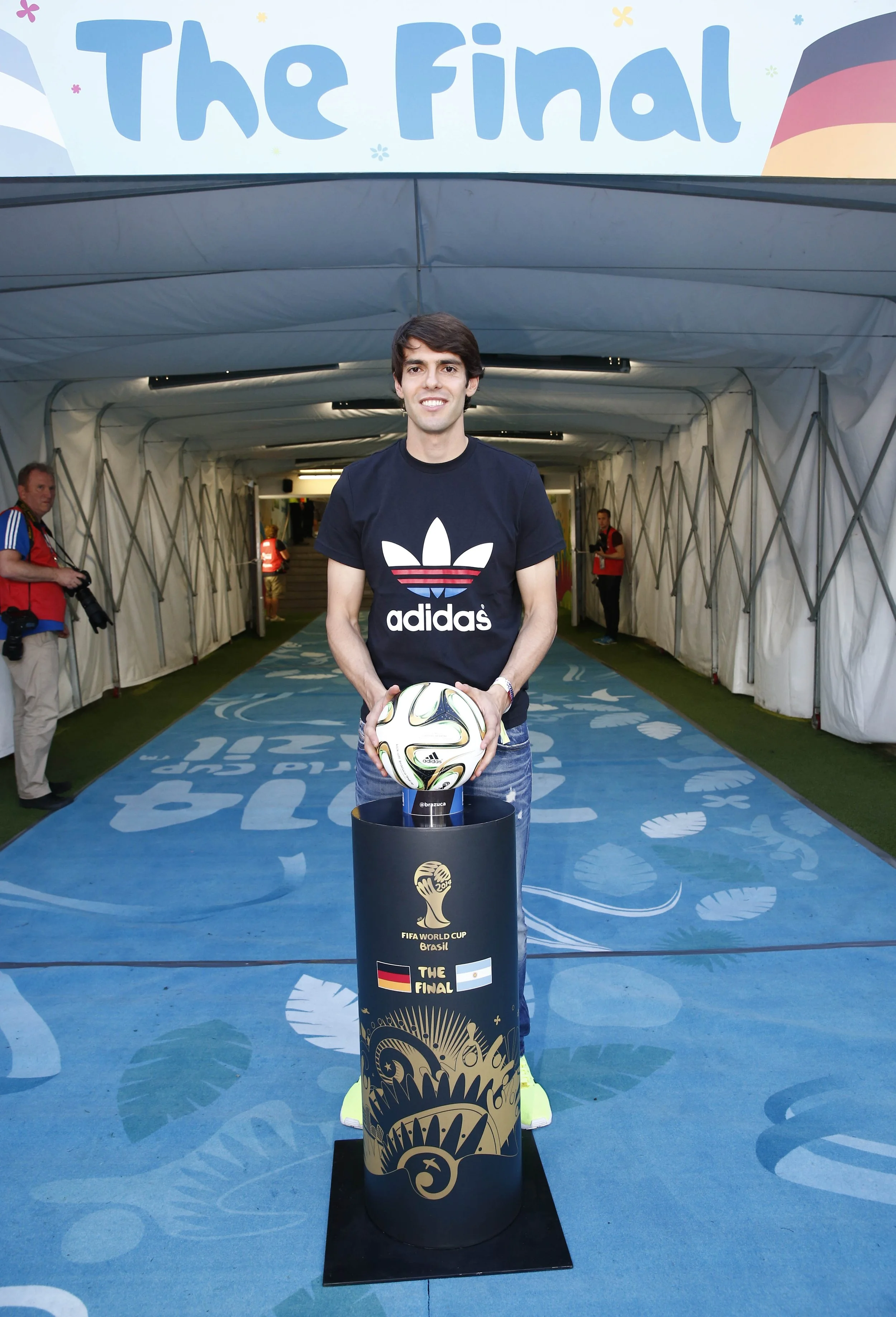
Host City & FIFA Fan Fest
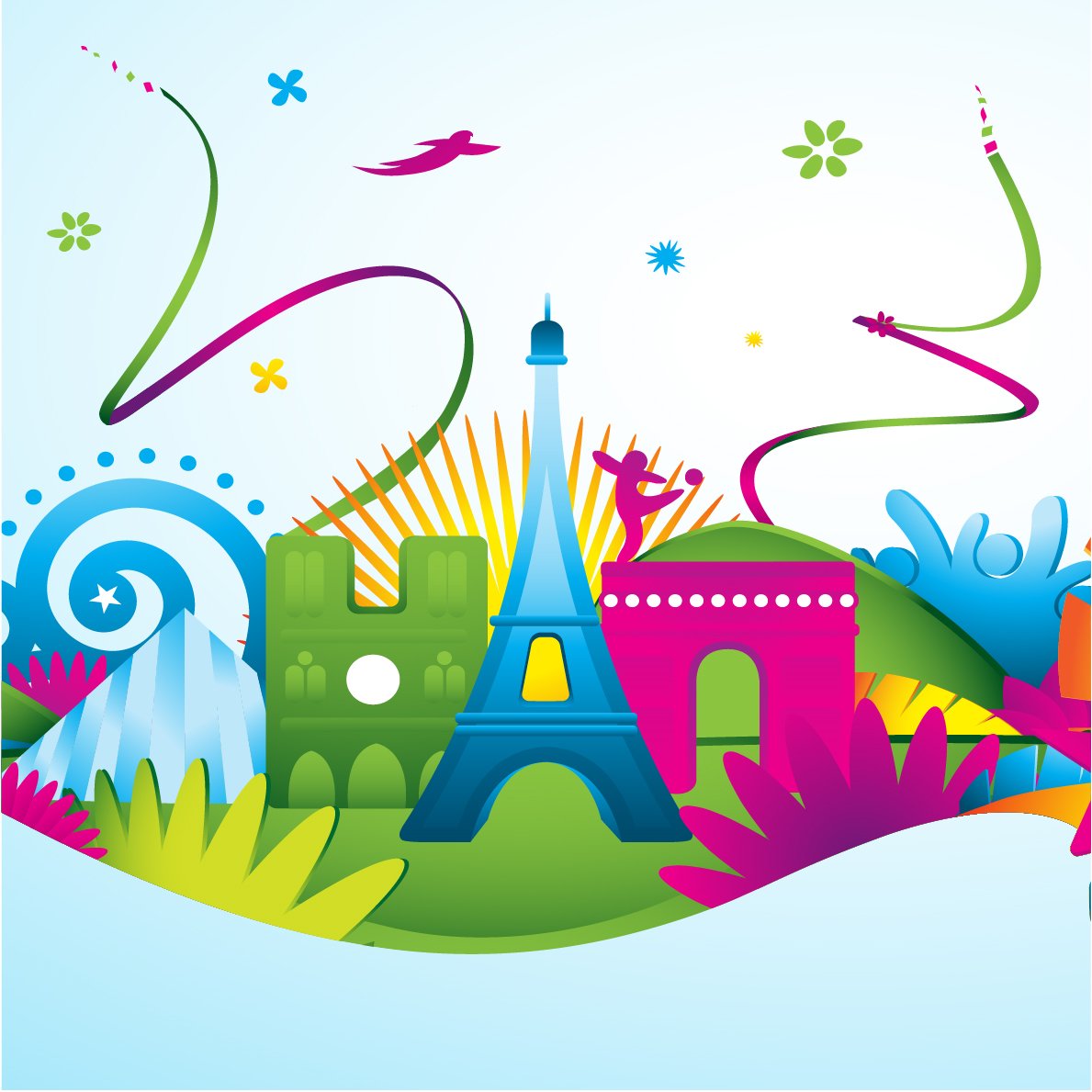
I created illustrations of participating stadiums and host city icons which could be used in conjunction with the main event key visuals.

Lockups
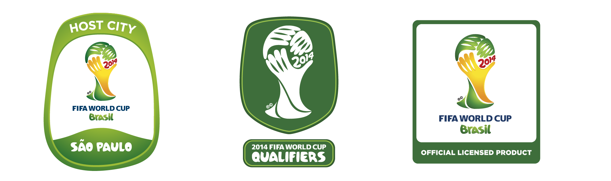
The official Emblem was required to work in various lockup devices and these in themselves became mini projects.
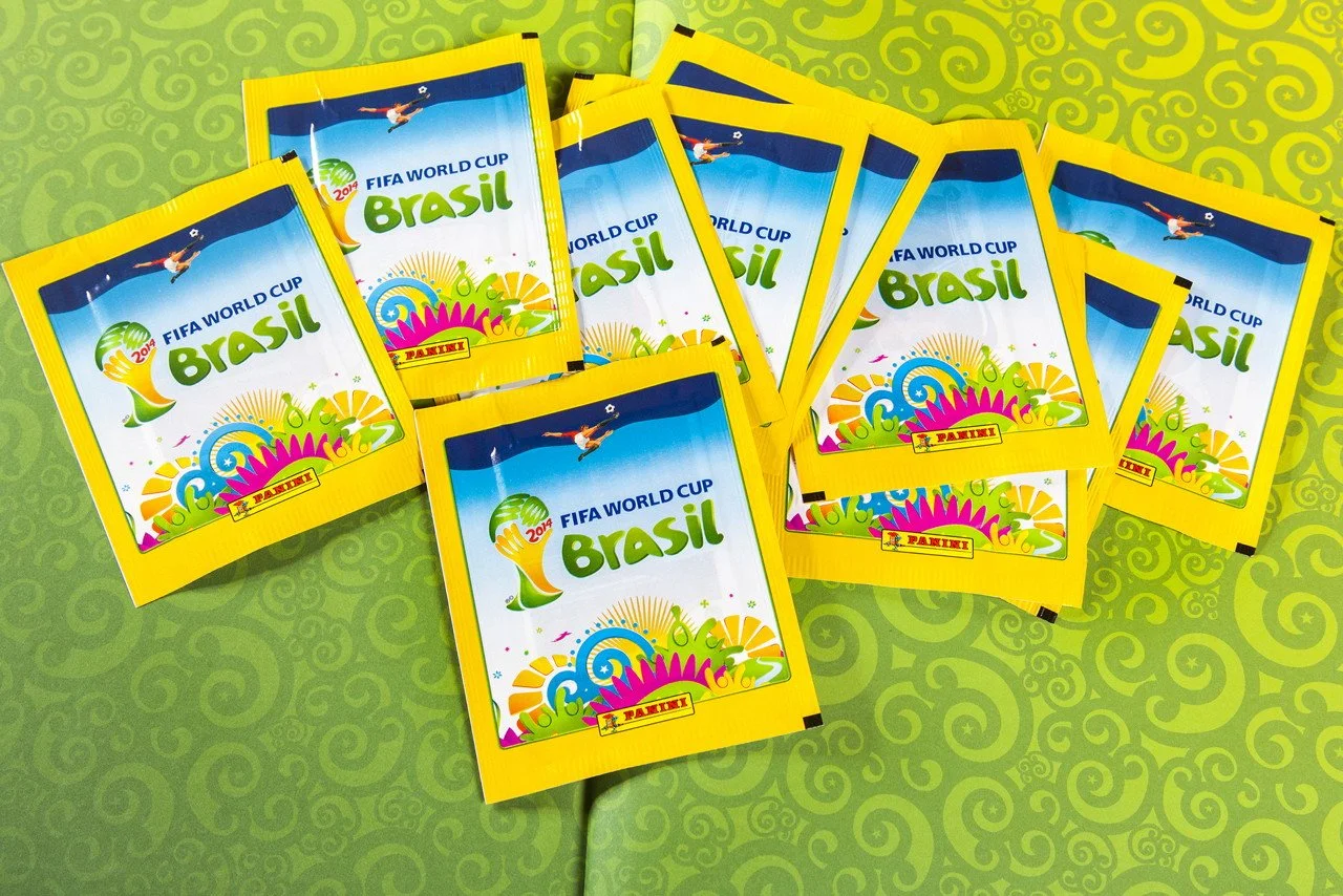
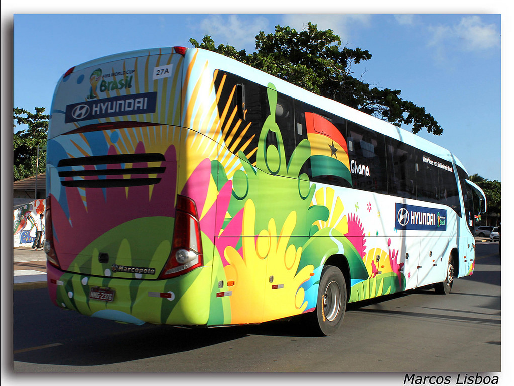
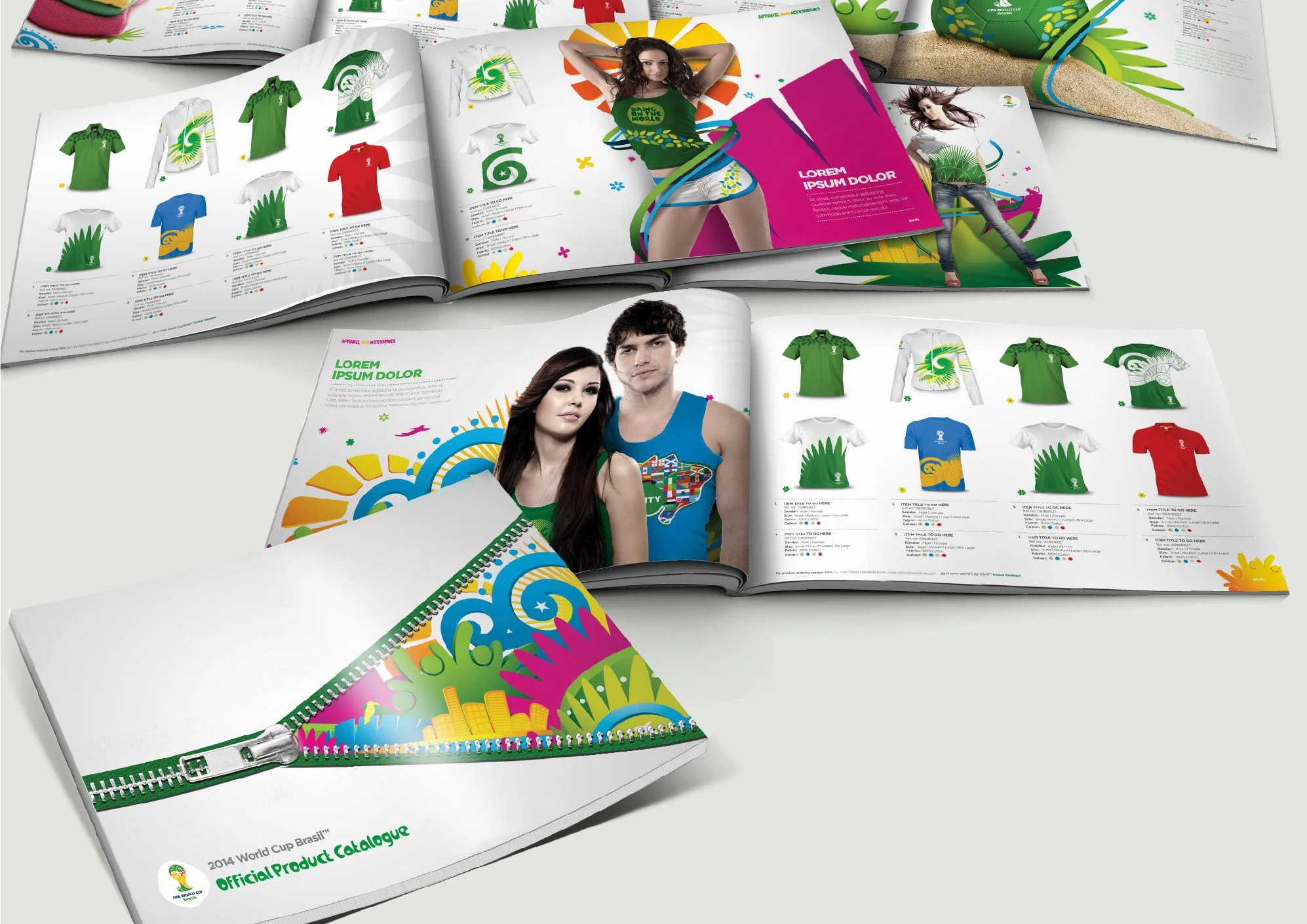
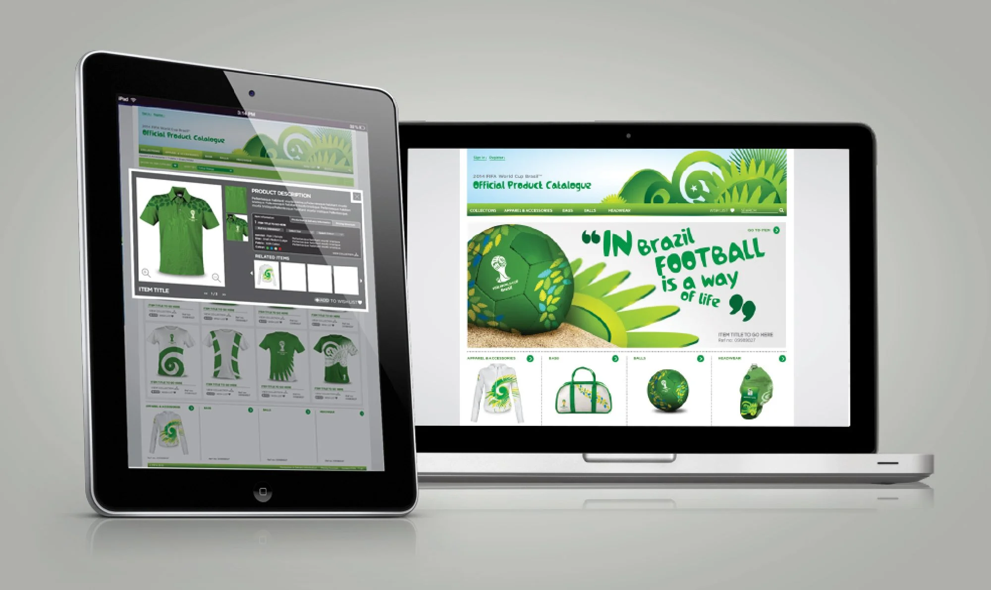
Licensing
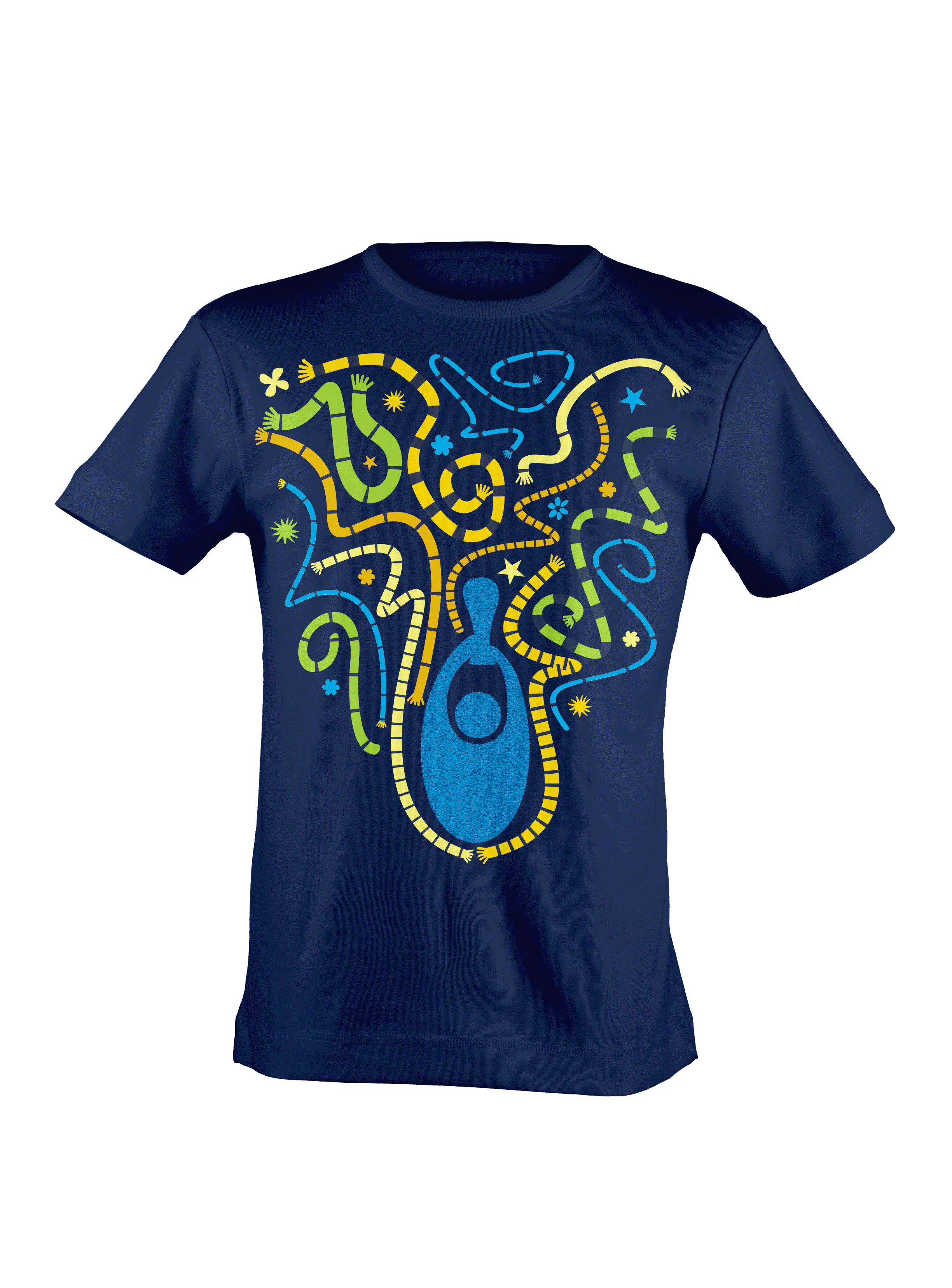
A range of licensing concepts were completed to create merchandise to appeal to various markets. Some of these were then intended to be sold through the official licensing platform which functioned as a hub for businesses looking to sell official merchandise.

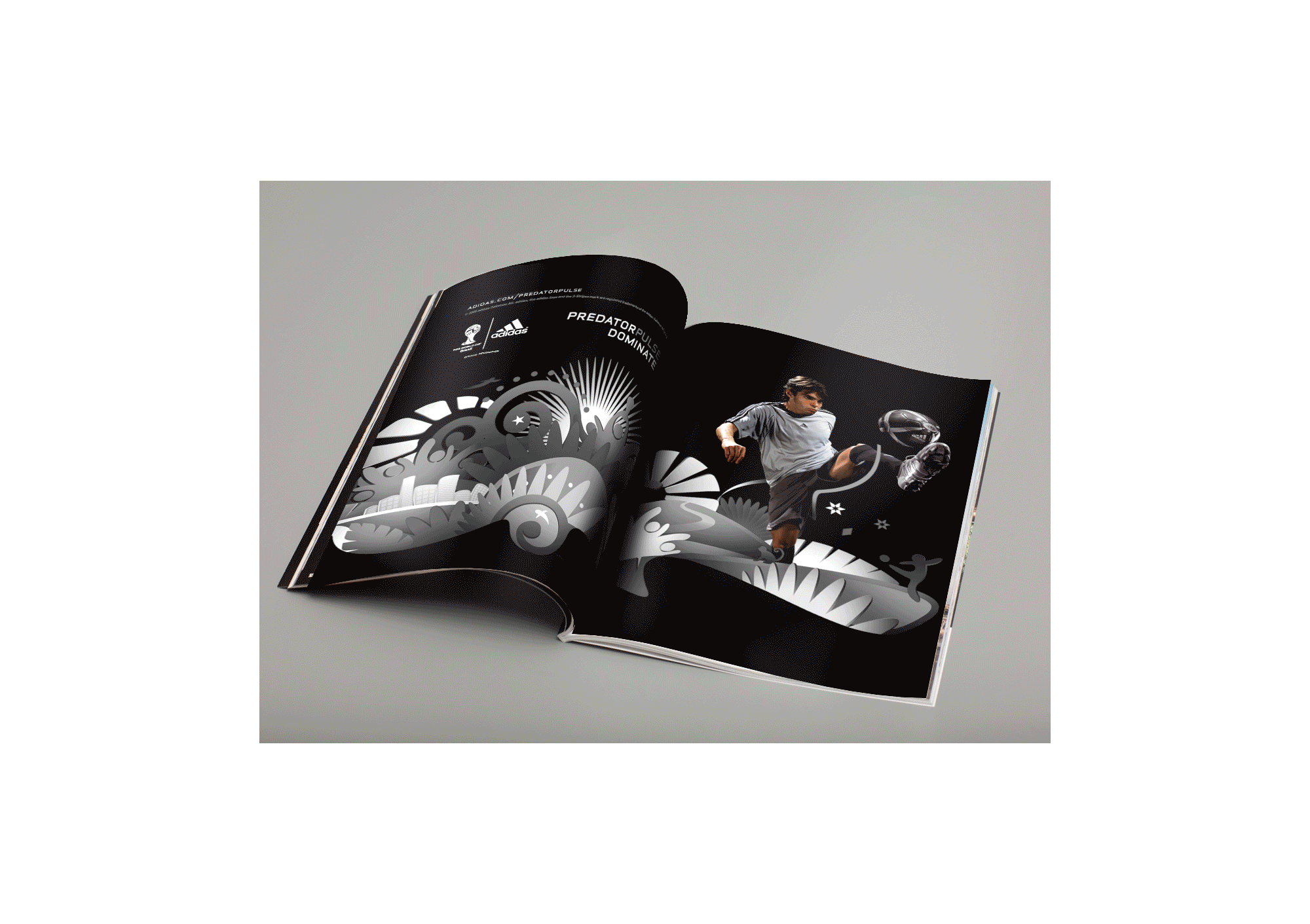
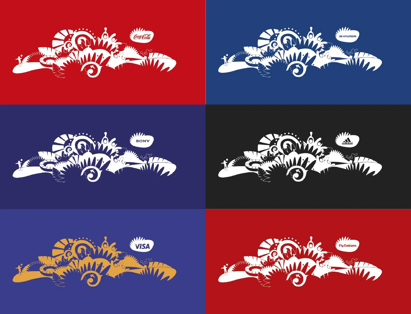
Partner Integration
We worked alongside FIFA to create suggestions for how tournament sponsers could integrate the Official Look with their products.
The Official Look was also developed to work in the brand colours of the various parterns.